


This guest post was written by Jay Slagle, an independent consultant and certified MadCap Software Advanced Developer who is passionate about using CSS to enhance the power of MadCap Flare. After discovering MadCap Software tools over a decade ago while working as a technical writer in Seattle, he has designed and implemented Flare projects for clients in government, law, education, healthcare, and technology. When he’s not occupied with all things Flare, Jay writes fiction under the pen name JB Strand.
How do you feel about image drop shadows? Love them or hate them, shadows and other image effects can liven up your documentation when used judiciously. In this article, I'll show you how to create shadows and other effects, building on the thumbnail markup from my last article. Minimally, this should demonstrate why image effects are better handled with CSS than through a drawing program. CSS image effects offer more flexibility and if you decide to change the look of your images, you just modify your stylesheet rather than re-edit all of your images.
Considerations — The hover effects demonstrated in this article are not interactive. Instead, I've used screenshots to illustrate each image's normal state and hover state.
Drop Shadows
In the last article, I showed you how to create an image thumbnail that has no border. Because CSS easily handles multiple entries for the same element (the effects being cumulative), I can define the drop shadow (technically, a box-shadow) as a separate stylesheet entry added below the class markup that defines the thumbnail:
img.Landscape400px
{
    padding-right: 4px;
    padding-bottom: 4px;
    box-shadow: 4px 4px 3px 2px rgba(0,0,0,0.1);
}
Considerations —
- The
paddingvalues in the example above are optional. I use them because the images are closely cropped. These CSSpaddingvalues add white space to the bottom and right side of the image to separate it from the shadow. - CSS cannot remove extra white space from around the image files themselves. That's why the best strategy I've found is to crop images closely and use CSS padding as needed.
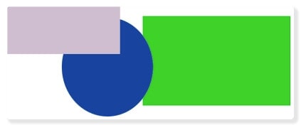
The Thumbnail and Its Shadow
This is how the thumbnail looks now that I've added the shadow:
Considerations —
- Keep in mind that thumbnail images and popup images are separate things. The CSS entries defined above affect only the thumbnail.
- None of the effects in this article require the use of thumbnails. They work perfectly well with any image class.
- Box shadows do not appear in the Flare GUI. To see them, you need to preview the topic or generate your output.
Shadow Placement
There's a lot going on with the box-shadow markup, and you'll want to have a good CSS reference available. To cover this quickly, think of a shadow as a box the same size as the image, but placed beneath it. The first two placement values (both 4px) move the shadow right (horizontal offset) and down (vertical offset), allowing it to peek out from under the image.
Considerations — The first two placement values can be negative to move the shadow left or up, respectively.
Shadow Appearance
The third value for box-shadow above (3px) is the blur, which feathers the edges of the shadow to make it look more, well, shadowy. The fourth-pixel value (2px) is a spread. This CSS effect makes the shadow larger.
RGBA Color Value
The last box-shadow value sets the shadow color in the RGBA format. This color format provides the same colors as a hexadecimal notation like #d0d3d5, which you could also use. But RGBA provides a bonus with its last value, an alpha channel setting that adds transparency. The alpha value can go from 0.0 (transparent) to 1.0 (opaque). The value shown above is pure black at RGB(0,0,0). It has a 10 percent opacity (0.1), effectively turning the black shadow a light gray.
Considerations — There are many web resources that explain the various CSS color notations. You can also find color generators that translate between the different notations.
Dynamic Borders
You are no doubt familiar with the hover effect. That's when an HTML element, such as a hypertext link, changes in appearance when you move the mouse pointer over it. Also known as a mouseover, hover image events are not limited to links. Here I'll show you how to change a border color on a hover event.
To augment the landscape-oriented thumbnail with a border (see the previous article for the markup), I add this to the stylesheet:
img.Landscape400pxBorder:hover
{
    border-color: fuchsia;
}
This addition should appear below the main thumbnail class in the stylesheet. That's because it is a separate entity known as a CSS pseudo-class. The :hover suffix (note the colon) added to the class name means that the specified attributes affect only a hover image event. Within this pseudo-class, I simply use the border-color attribute to change the border from orange to fuchsia on a mouseover.
Thumbnail with a Changing Border
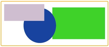
Here is a thumbnail with a border:
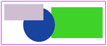
Here's how the border changes on a hover effect:
Considerations —
- You can change any border property, including the thickness and style, by defining the proper attributes in your
:hoverpseudo-class. - The image hover effect does not work within the topic files you edit in the Flare GUI. Preview the topic or generate and view your HTML output to see them.
Grayscale
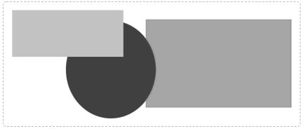
Don't worry, Game of Thrones fans, grayscale isn't as scary as you think. As you can see in the examples above, my color images are quite colorful. To tone down the thumbnails, I add a filter: grayscale value. Set to 85% here, the thumbnail colors are muted, looking something akin to a faded photograph.
img.Portrait250pxBorder
{
    filter: grayscale(85%);
}
To bring the color back up on a mouseover, I add an image hover effect that removes the filter:
img.Portrait250pxBorder:hover
{
    filter: grayscale(0%);
}
Thumbnail Shades of Gray
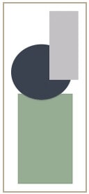
Here's how the thumbnail looks with most of its color removed:
Here, the color is reinstated on a hover event:
Considerations —
- Again, these CSS image effects do not appear in the Flare GUI source topics.
- The
grayscalevalue affects the CSS border and box shadow as well. - Some older browsers won't render a
grayscalefilter, but up-to-date browsers handle it fine.
Mix and Match
Below are a few examples of how you can mix and match CSS effects with hover events to create a range of dynamic styles in thumbnail images. In all of these examples, only the thumbnails differ. The popup image is the same for all of them.
Shadow Lift
In this example, the image has no border, but the box-shadow is spread out enough that it appears to create a border on the left and top sides:
On a hover event, the shadow increases in size and transparency. That, along with some margin trickery, makes the image appear to lift off the screen:
img.ShadowLift
{
    mc-thumbnail: popup;
    mc-thumbnail-max-height: auto;
    mc-thumbnail-max-width: 400px;
    padding: 10px;
    margin-left: 2px;
    box-shadow: 2px 2px 4px 2px rgba(0,0,0,0.3);
}
img.ShadowLift:hover
{
margin-left: 0px;
box-shadow: 4px 4px 6px 4px rgba(0,0,0,0.2);
}Hover Swap
In this example, the effects attributes change on a hover event. The grayscale disappears, the border changes style, and a box shadow appears. Here's the normal image thumbnail:
Here’s the hover state:
img.HoverSwap
{
    mc-thumbnail: popup;
    mc-thumbnail-max-height: auto;
    mc-thumbnail-max-width: 400px;
    margin-bottom: 10px;
    padding: 11px;
    border: 1px dashed #b9bec1;
    filter: grayscale(100%);
}
img.HoverSwap:hover
{
padding: 10px;
border: 2px solid #ffb6c1;
box-shadow: 8px 8px 10px 4px rgba(185,190,193,0.6);
filter: grayscale(0%);
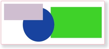
}Hover Halo
This image thumbnail has a steelblue border (not to be confused with blue steel).
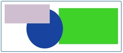
On a hover event, the border is replaced by a centered box shadow that is orange-red in color:
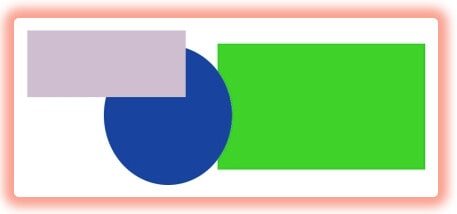
img.HoverHalo
{
    mc-thumbnail: popup;
    mc-thumbnail-max-height: auto;
    mc-thumbnail-max-width: 400px;
    margin: 15px;
    padding: 10px;
    border: 2px solid steelblue;
}
img.HoverHalo:hover
{
padding: 12px;
border: none;
box-shadow: 0px 0px 10px 10px rgba(255,99,71,0.6);
}Considerations — In these last two examples, I change the padding values on hover events to compensate for changes in border width. This keeps the images from appearing to move on the mouseover. CSS provides a more sophisticated way of handling this, called border-box, but I'll leave that for another day.
Summary
CSS is full of tools for adding visual magic to HTML outputs. Now that you have a grasp on basic image effects and the hover event syntax, you can use these features creatively in your documents. However, before you go wild creating image effects, consider the next article, in which I'll take a look at image events on touchscreens.
Editor's Notes: Originally published on May 18, 2020, and updated on September 7, 2021.


