


This guest post was written by Jay Slagle, an independent consultant and certified MadCap Software Advanced Developer who is passionate about using CSS to enhance the power of MadCap Flare. After discovering MadCap Software tools over a decade ago while working as a technical writer in Seattle, he has designed and implemented Flare projects for clients in government, law, education, healthcare and technology. When he’s not occupied with all things Flare, Jay writes fiction under the pen name JB Strand.
In my last article, I showed you how to create image effects, many of them involving hover events, aka mouseovers. "That's fine and dandy for desktops," I hear you ask, "but what about touchscreens?" That's an excellent question! In this article, I'll address some of the issues around using CSS effects for images displayed on touchscreens.
This question of using touchscreens brings home an important point. When working with MadCap Flare, you have to think in multiple dimensions, typically four: desktop, tablet, mobile, print. It's common to design HTML outputs using a large desktop screen, where you have plenty of room for bells and whistles. But experienced web designers will tell you to design for mobile first because it's easier to build out from a smaller screen than to pare down from a larger one. In addition to screen sizes, you need to consider the user's input method, whether it is a mouse pointer or fingers on a touchscreen.
Considerations — The terms desktop, tablet and mobile have various meanings in Flare:
- The terms typically refer to screen widths defined by the
TabletandMobilebreakpoints on an HTML5 target'sSkintab. These breakpoints can affect features such as conditional text display. When it comes to screen sizes, Flare refers toWebmode rather thanDesktop. - The terms can also refer to input methods. In this sense, desktop refers to the use of a pointing device such as a mouse or a trackpad. The terms tablet and mobile refer to touchscreen devices. In this sense, many laptops can function as either desktops or tablets.
Thumbnail Popups on Hover Events
First, I want to consider the thumbnail images from previous articles. In those examples, the full-size image appeared whenever you clicked the thumbnail (or tapped it on a touchscreen). However, Flare can also pop up the full-size image on a hover event. So should you use mouseovers to display the full image? My answer is no. To demonstrate the reason for this, consider the following example.
Click Popup
When creating image thumbnails, I used this attribute in the image classes:
mc-thumbnail: popup;
That, along with the other class attributes, created a thumbnail like this:
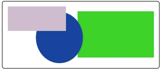
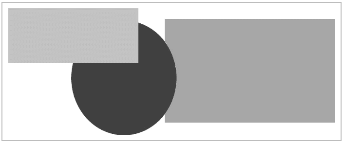
When clicked, the thumbnail expands to a large image like this:

On a Desktop
- Click the image to expand.
- Click the image or click anywhere off the image to reduce.
On a Touchscreen
- Tap the image to expand.
- Tap the image or tap anywhere off the image to reduce.
Hover Popup
Alternatively, you can set the full-size image to appear on a hover event:
mc-thumbnail: hover;
On a Desktop
- Hover over the image to expand.
- Hover off the image to reduce.
On a Touchscreen
- Tap the image to expand.
- Tap off the image to reduce because a touchscreen device does not recognize a "hover off" event until you tap something else on the screen. Herein lies the problem. I think most users' instincts would be to tap the image again to reduce it. But they have to tap anywhere except the image. On a very small screen, this can become extra burdensome if the popup image takes up most of the screen real estate.
Hover Effects on Touchscreens
On touchscreen devices, browsers understand the :hover pseudo-class, but for dynamic effects with thumbnail images, the hover event (in practical terms) collapses into the click event. Most touchscreen users will see a hover effect only for a fleeting second before the full-size image pops up. With Flare, you can use the stylesheet's tablet and mobile media query sections to modify behavior on smaller screens, but there are some exceptions with thumbnails, and this illustrates an important point.
Tablet and Mobile Media Sections
First, let's review the tablet and mobile sections of the stylesheet, which follow the default section:
...Default styles at the beginning of the stylesheet...

@media tablet
{
    ...Tablet styles inherit values from the default section...
}

@media mobile
{
    ...Mobile styles inherit values from the tablet section...
}
Considerations — Unlike the default section, the tablet and mobile sections require all markup to be enclosed in a set of curly braces. When you use Flare to tidy your stylesheet, the text in these sections is indented at least one level deeper than these outer braces.
Processed Styles in Tablet and Mobile Modes
In the previous article, I demonstrated a thumbnail that was grayed down until you moused over it. Touchscreen users probably won't register the hover event that unveils the color in the thumbnail, though the full-size, full-color image will pop up just as it does on the desktop. So for tablet and mobile users, I should be able to turn the thumbnail's grayscale effect off with markup like the following, right?
@media tablet
{
    img.Portrait250pxBorder
    {
        filter: grayscale(0%);
    }
}Actually...no. The reason for this is complex, and I'm going to simplify it greatly here. Flare elements like image thumbnails and drop-downs are not things that a browser naturally understands. These elements, which I call processed styles, typically include the use of stylesheet attributes that start with the mc- prefix. These attributes function as instructions that Flare uses when generating the output for a target.
In an HTML5 output, the processed styles may turn into multiple styles tied into Javascript functions. (Recall how using thumbnail styles resulted in the inclusion of a separate MCPopupFullImage style class for full-size popup images.) For this reason, changing an attribute of a processed style in the stylesheet's tablet or mobile section may or may not have an effect.
The point I want to make here is simply one of practical advice. When you start using CSS to do things such as add effects, you can run into limitations based on how Flare generates certain elements in the outputs.
Pass-through Styles in Tablet and Mobile
For typical XHTML elements, what I call pass-through styles, overrides set for the tablet and mobile modes work as you'd expect. For example, below is a non-thumbnail image that uses the grayscale hover effect in desktop mode, but dispenses with the effect in tablet and mobile modes. On a desktop screen, it looks like this:
If you hover the cursor over it on a desktop, or if you display it in tablet or mobile mode, the image looks like this:
The markup for this is simple:
img.Grayscale
{
    padding: 10px;
    border: 2px solid var(--GrayMedium);
    filter: grayscale(100%);
    max-width: 75%;
}

img.Grayscale:hover
{
    filter: grayscale(0%);
}

@media tablet
{
    /* Turn off grayscale effect and allow the image to render
    at a higher percentage width in tablet and mobile modes. */

    img.Grayscale
    {
        filter: grayscale(0%);
 max-width: 100%;
    }
}
Summary
There's a lot to grapple with in this article:
- When designing a Flare HTML5 output, don't forget about the touchscreen experience.
- In practical terms, hover events and click events collapse into one on touchscreens, and hover events may not register with your audience.
- The stylesheet's tablet and mobile media modes can modify the output behavior for touchscreen devices, but there's more to this than meets the eye:
- For basic HTML styles, what I refer to as pass-through styles like standard image and paragraph classes, the tablet and mobile settings will change how the elements render.
- For what I call processed styles, the Flare-specific elements that include a lot of attributes with
mc-prefixes, the tablet and mobile settings might not be able to override the operation of the element as defined in the default section of the stylesheet.


