


Jay Slagle is an independent consultant and certified MadCap Software Advanced Developer who is passionate about using CSS to enhance the power of MadCap Flare. After discovering MadCap Software tools over a decade ago while working as a technical writer in Seattle, he has designed and implemented Flare projects for clients in government, law, education, healthcare, and technology. When he’s not occupied with all things Flare, Jay writes fiction under the pen name JB Strand.
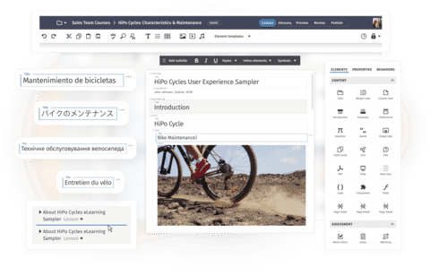
Who doesn't love image thumbnails? They provide two extremely helpful features in HTML5 outputs. First, thumbnails shrink large images so that they don't overwhelm the words on the page. Second, they pop up the full-size image in a separate window that lifts it away from the text flow, allowing it to appear larger than it could if it were constrained within the text column. In this article, I'll show you how to create image thumbnail classes in your stylesheet to set up a simple and consistent approach for handling images.
In the examples below, you can copy and paste the CSS into the text editor. If you are new to Flare and CSS, you can use Flare’s internal CSS editor to create and manage the thumbnail classes.
The <img> Tag
The <img> tag adds an image to a MadCap Flare topic. So if you want all of your screenshots to have a thumbnail and a border, you set those properties for the <img> tag, right? Wrong! That would be a big mistake because the <img> tag is used for all images, including the graphical widgets you can click to open and close drop-downs. Adding style attributes to the basic <img> tag can result in a lot of visual nuttiness. The only CSS properties you should place on the <img> tag itself are the following:
img
{
    border: none;
    max-width: 100%;
}
Considerations —
- The
bordervalue ensures that images do not have borders by default. This is typically the case, so the value here just adds insurance. With borders removed from images in general, you can add borders to specific image classes. - The
max-widthof100%keeps images from growing larger than their containers, preventing them from getting cut off or from overspilling their boundaries. This simple attribute can save you a lot of grief, especially if you create PDF outputs where high-resolution images can easily render larger than the page unless you keep a lid on them.
Image Thumbnail Classes
Whenever you want to add styling attributes to images such as screenshots, create image classes in your stylesheet. A style class modifies its parent style, which is the img style in this case. You can create classes in the text editor or with Flare's GUI CSS editor, which takes care of the syntax for you (more about that here). In the following, I define two image classes, one intended for images in landscape orientation, another better suited for images in portrait orientation. Your class names and size values may differ:
img.Landscape400px
{
    mc-thumbnail: popup;
    mc-thumbnail-max-height: auto;
    mc-thumbnail-max-width: 400px;
}
img.Portrait250px
{
mc-thumbnail: popup;
mc-thumbnail-max-height: 250px;
mc-thumbnail-max-width: auto;
}Considerations — Whenever you set any type of max-height or max-width value for an image, set the other value to auto to maintain the ratio for the image dimensions.
Image Borders Using CSS
Although you can use screen capture and drawing tools like MadCap Capture or Snagit to add borders around images, you can also employ your stylesheet to spare you that labor. Suppose I have a mix of images, some with borders in the image files themselves and some without borders. To handle the borderless images, I create additional image classes that replicate the thumbnail properties of the previous two classes, but that also add borders to the images:
img.Landscape400pxBorder
{
    mc-thumbnail: popup;
    mc-thumbnail-max-height: auto;
    mc-thumbnail-max-width: 400px;
    border: 2px solid orange;
    padding: 10px;
}
Considerations — If borders are disabled for the img tag itself, these classes must appear after the main img entry in the stylesheet.If you are using Flare’s built-in CSS editor, the new styles will be added to the end of the stylesheet.
Border Style
CSS comprises many specific border attributes such as border-width and border-style, but it is also full of handy shortcuts like the one I use above. To add a simple border around the entire image with a single line of markup, follow this CSS syntax:
border: width style color;In the preceding image classes, the border is two pixels around all sides of the image. The style is solid, which means a solid line (alternative options include dashed and dotted). The last value is the border color, for which you can use a hexadecimal color value, though here I use the predefined color name orange. Refer to my previous article for information about using CSS variables for attributes like colors.
Padding
The padding value shown above adds space between the image's cropped boundaries and the border. The single 10px value pads ten pixels of space around all sides of the image. If you crop images closely, you'll want some padding. Otherwise, no. You'll need to experiment to find the value that works best for your images. You can also use Flare’s Style Inspector to see the style details for a topic or snippet and to edit the styles without opening the full stylesheet.
Border Radius
Flare thumbnails have a default border-radius of five pixels, which gives them a rounded look. (The higher the pixel value, the rounder the border.) For the landscape thumbnail above, I'm keeping the default. For the portrait thumbnail, I've specified zero pixels to make the border corners square.
Popup Image Border Outline
The full-size images that pop up when thumbnails are clicked have their own borders, though the attribute that creates them is outline, not border. This outline is defined by the image class MCPopupFullImage, and it applies to all popup images for all thumbnails.
CSS outlines and borders are similar, but they have different purposes. Outlines are used to highlight selected elements, and when you tab through a web page, you often see an outline around each element as it is selected. I don't recommend messing with outline attributes outside of this single case of popup images. The border property is for persistent borders, and the setting carries through to PDF. But because the outline attribute is used for the popup image already, it's easier to modify it than to add a competing border.
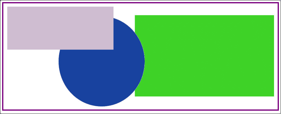
For the sake of consistency, you may want to use the same color value with popup image outlines as you do with thumbnail borders. To illustrate the difference between the border and the outline in the examples below, I'm setting a four-pixel outline with the predefined color name purple:
img.MCPopupFullImage
{
    outline: 4px solid purple;
    padding: 10px;
    mc-hidden: hidden;
}
Assigning Image Thumbnail Classes
Once you have created your image classes, it is a simple process to assign them. Add the image to a Flare topic, right-click the image, and choose the image class:
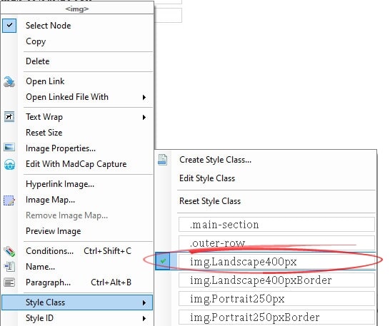
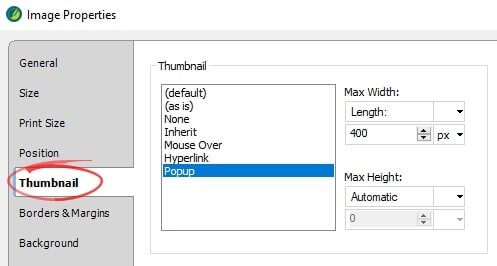
If you then examine the image properties (F4), you'll see that the Flare GUI reflects the stylesheet settings:
Thumbnail Results
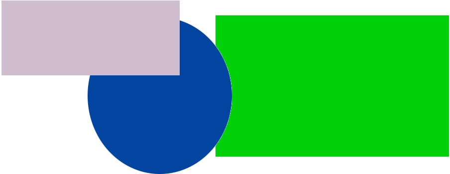
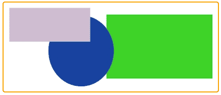
Below are examples of the image thumbnail styles defined above. These images do not have any borders within the image files themselves, and they are closely cropped to demonstrate how the padding value adds space between the images and the CSS borders.
Default Popup Image
First, here's a screenshot that shows how a popup image would appear with its default outline. (I can't show you actual popups in this article.)
This is how the popup with the modified outline looks:
Thumbnail Class: img.Landscape400px
Starting here are screenshots of non-clickable thumbnails that result from the image classes described above. The following thumbnail has a maximum width of 400 pixels. There is no border on the thumbnail, but the popup has a purple outline and some padding around the image.
Thumbnail Class: img.Landscape400pxBorder
The following thumbnail has a maximum width of 400 pixels and a border with the default radius of 5 pixels.
Thumbnail Class: img.Portrait250px
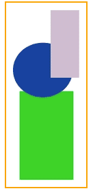
Here, the thumbnail has a maximum height of 250 pixels. There is no automatic border on the thumbnail.
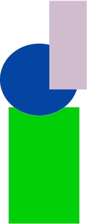
Thumbnail Class: img.Portrait250pxBorder
The final thumbnail has a maximum height of 250 pixels and an orange border. The border radius is zero, making the border corners square.
Summary
Image classes provide a simple way to create image thumbnails and popups, as well as to add borders to images automatically. With a bit of experimentation, you can find the image classes and attributes that work best for you. In the next article, I'll cover some CSS effects that add visual pizazz to your documents. For other articles in this series, read part one covering Hacking CSS in MadCap Flare.


.jpg?format=avif&q=60&w=384&h=216)