


This guest post was written by Jay Slagle and is part four of a four-part MadCap Flare CSS series. Jay is an independent consultant and certified MadCap Software Advanced Developer who is passionate about using CSS to enhance the power of MadCap Flare. After discovering MadCap Software tools over a decade ago while working as a technical writer in Seattle, he has designed and implemented Flare projects for clients in government, law, education, healthcare, and technology. When he’s not occupied with all things Flare, Jay writes fiction under the pen name JB Strand.
In the previous articles of this series, I showed you how to use custom typefaces in MadCap Flare HTML and PDF outputs. Although choosing font faces is a major aspect of document design, the work doesn’t stop there. An attractive page layout requires attention to font sizing, line heights, and letter spacing. In this last article, I’ll cover some important text sizing values, showing you how to set up a stylesheet that modifies font sizes in different outputs without tweaking every HTML element individually.
Measurement Units for Online and Print Documents
A rule of web development says to use relative units such as pixels and percentages for web layouts and static units such as points and inches for print outputs. This came about, at least in part, because early browsers had trouble scaling layouts that mixed different methods of measurement.
Times have changed and browser layout engines have become more sophisticated, so that rule is not so iron-clad. For instance, point measurements generally work OK in HTML. Nonetheless, it’s a good idea to stick to the measuring units meant for online or print layouts when defining each medium.
The following table shows the measurements I like to use in online and print layouts.
Measurement Type | HTML | |
|---|---|---|
Font sizes and line heights | rems (rem) and | points (pt) and |
offsets, such as the indentation | pixels (px) and | inches (in) or centimeters (cm) |
rem Units
It’s quite alright if you are fuzzy on the concept of rems. They are a fairly new invention of the online world. The term ”rem” stands for “root em,” a unit of measurement tied to the :root section of the stylesheet. The default is:
1 rem = 16 pixels = ~12 pointsIf you are familiar with point sizes, think of 1 rem as 12 points and multiply or divide from there. A 24-point heading converts to 2rem. A 9-point text size becomes 0.75rem.
rem or em?
The rem unit works much like the em unit, which hails from the print world but can also be used online. But whereas rem units are relative to the stylesheet's :root element, em units are relative to their HTML containing elements. The upshot is that using em units can lead to cases where the text gets unexpectedly larger or smaller (you can read more about that here.). Even though there’s a workaround for the scaling effects of em units, rem units are simply easier to manage for online outputs.
Changing the Default rem Size
A handy aspect of rem sizing is that you can tell the browser to change the default of 1 rem from 16 pixels to another size by adding the font-size attribute to the stylesheet’s :root element. For example, if you change the rem default to 18 pixels, every HTML attribute that uses a rem value increases in size. This includes navigation menu entries — elements generally not affected by your stylesheet settings — as long as they are defined using rem units in the SideNav or TopNav skin.
Variables for Font Sizes
The fundamental tool for making font sizes consistent and easy to change is the CSS variable. For example, if you set your basic text size to 1 rem, you can define a smaller size for elements such as footer and table text and a larger size for elements such as figure captions or drop-down headings.
Here is an example of the :root element defining text sizes using CSS variables and rem units. I have included the font-size attribute but have kept it at its default of 16 pixels:
:root
{
   --FontSizeNormal: 1rem;
   --FontSizeSmaller: .9rem;
   --FontSizeLarger: 1.2rem;
   font-size: 16px;
}
Line Height
Line height, the vertical spacing between lines of text, is often overlooked in HTML and PDF styling. Although an element's default line height is generally acceptable, you can often improve readability by adding line-height values to your HTML elements. Line heights can be measured in any unit, such as a rem or a point size, but using percentages in CSS variables is advantageous because the line height values then work for any font size.
HTML Line Heights
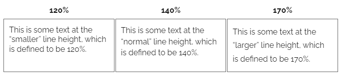
What line height to use depends on the medium and the typeface. With HTML output and sans-serif fonts, increasing the line height often enhances readability. Here are some examples of my online font Raleway at different values. The CSS markup used to create these examples is shown at the end of this article.
PDF Line Heights
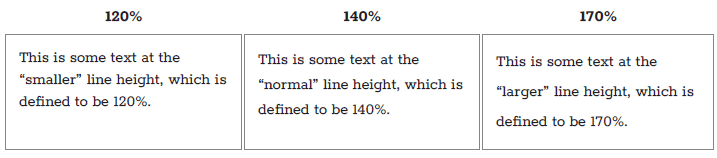
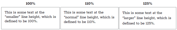
When you work in a print medium and particularly with a serif font, a smaller line height is often the way to go. Here is my print font Rokkitt using the same percentages as the preceding HTML samples:
In these instances, a smaller line height is preferable, so here are the same paragraphs with the line heights adjusted down. The CSS sample at the end of this article shows how to override the default HTML line heights to create these line heights for print:
Letter Spacing
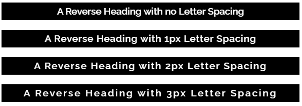
Another useful CSS attribute is letter-spacing, which tweaks the horizontal spacing between letters. This can make text more readable, particularly ALL-CAPS TEXT or reverse text that uses a light font color against a dark background. These are also situations where a semi-bold font face can help prevent text from looking too blocky:
Font Sizing in the Stylesheet
The following is a simple stylesheet that uses :root to set text values in variables. Similar to the stylesheet example in my last article, this example adds font sizes and line heights to the variables that select the typefaces.
Default HTML Styles
The secret with CSS is not to define the font family, text size, line height and so on for every single element. The :root section and body tag can define your overall approach to fonts and text sizing.
:root
{
    --FontHeading: 'Raleway', sans-serif;
    --FontText: 'Raleway', sans-serif;
   --FontCode: 'Source Code Pro', monospace;
   --FontSizeNormal: 1rem;
   --FontSizeSmaller: .9rem;
   --FontSizeLarger: 1.2rem;
   --LineHeightNormal: 140%;
   --LineHeightSmaller: 120%;
   --LineHeightLarger: 170%;
    font-size: 16px;
 }
body
{
   font-family: var(--FontText);
   font-size: var(--FontSizeNormal);
   line-height: var(--LineHeightNormal);
}
HTML Overrides
Subsequent elements can override the primary text settings as needed. Here, the h1 element switches the heading style to a different typeface and sets a font size in rem units.
h1
{
    font-family: var(--FontHeading);
    line-height: var(--LineHeightNormal);
    font-size: 2.4rem;
    letter-spacing: 2px;
}
Here I add a figure caption element that is a class of the standard paragraph. I specify an extra bold font face and use the “larger” font size:
p.FigureCaption
{
    font-family: 'Raleway ExtraBold';
    font-style: normal;
    font-weight: 800;
    font-size: var(--FontSizeLarger);
    letter-spacing: 1px;
}
Print Styles
In the print section of the stylesheet, I simply change the variable values in the :root section to use my serif font for text and Courier New for code, leaving the heading text the same. For the text sizing variables, I specify point sizes and reduce the line heights. Because the default values for body use variables that are updated in the print root section, I don’t need to tweak the body element at all. I just modify the h1 and p.FigureCaption elements to change or add specific values needed for print.
@media print
{
   :root
   {
       --FontText: 'Rokkitt', serif;
       --FontCode: 'Courier New', monospace;
       --FontSizeNormal: 11pt;
       --FontSizeSmaller: 9pt;
       --FontSizeLarger: 13pt;
       --LineHeightSmaller: 100%;
       --LineHeightNormal: 110%;
       --LineHeightLarger: 125%;
     }

    h1
    {
      font-size: 30pt;
    }

    p.FigureCaption
    {
       font-family: 'Rokkitt ExtraBold';
      page-break-after: avoid;
   }
 }
Summary
Although it can take some experimenting, adding line heights and letter spacing to text can greatly improve the readability and attractiveness of your online topic or printed page. When you use CSS variables in the stylesheet’s :root section to manage text, you can easily change text attributes in PDF outputs without having to modify every paragraph style.
If you're an author who regularly writes technical documents or need a software to keep your documents organized, try our Madcap Flare authoring tools free trial for 30-days!


