This guest post was written by Jay Slagle and is part one of a four-part MadCap Flare CSS series.
Jay is an independent consultant and certified MadCap Software Advanced Developer who is passionate about using CSS to enhance the power of MadCap Flare. After discovering MadCap Software tools over a decade ago while working as a technical writer in Seattle, he has designed and implemented Flare projects for clients in government, law, education, healthcare, and technology. When he’s not occupied with all things Flare, Jay writes fiction under the pen name JB Strand.
Once I realized that my favorite Saturday Night Live skit concerned typography, I came to accept that I was a font nerd. Typography is a fascinating field, with so many font faces to choose from. The typefaces you use in your MadCap Flare projects can make your HTML and PDF outputs shine — or fall flat. But figuring out how to use fonts correctly in HTML and PDF outputs is not always easy.
In a series of four articles, I’ll show you how to use custom typefaces in HTML and PDF outputs. In this first article, I'll explain why it's good to use custom typefaces and cover some considerations for choosing font weights. The second article will show you how to add custom font definitions to HTML5 outputs. The third article will cover font installation and alternate fonts for PDFs. The last article will provide some tips for using CSS variables to manage font sizes.
The Problem with Font Substitution
Has this ever happened to you? Your Flare output uses a certain Windows typeface. You generate a PDF and it looks awesome! You generate an HTML5 output and it looks great! You put the HTML5 output on the Web, browse to it on your phone, and it looks...terrible!
The problem is that an HTML output does not include font definitions, so the browser has to locate the typeface on the operating system. Your HTML output will look fine on your Flare machine, but on a device such as your phone, the browser typically needs to substitute a typeface found on its local OS. While a substituted font probably won't look terrible, it won’t look the same.
In HTML, there’s a method for dealing with this by specifying multiple fonts. In a default Flare Side Navigation project, for example, the body tag in the stylesheet sets the font family, which is inherited by the topic body text and headings:
body
{
color: var(--Dark);
font-family: Arial, Avenir, Myriad;
}
Here, Arial is the primary typeface, Avenir and Myriad are fallbacks. Although Arial is fairly ubiquitous across devices, most other fonts are not. These days there are a lot of device types, and every operating system (Windows, MacOS, iOS, Android, Linux) includes a different set of typefaces. Trying to keep up with them is nearly impossible. Even if you were to specify a typeface for every possible device, other problems with font substitution loom.
Not All Fonts are Equal (Sizes)
Font substitution frequently creates layout headaches. Rendered with a different font than the one you work with in Flare, tables and responsive layouts can get thrown off by the different space (horizontal and vertical) that different typefaces take up. Note how different the spacing is for these typefaces even though they are all 12 points:

Custom Fonts to the Rescue
Because font substitution can throw a monkey wrench into your layouts, not to mention your branding standards, including the font definitions with your HTML5 output is the best way to create a consistent look across all devices.
What to Look for in Custom Typefaces
For some Flare users the choice of fonts is determined by organizational branding or web site standards. If the choice is yours to make, the first thing to consider is how many font families you will need. A typical Flare HTML output uses two or three typefaces:
1 - Heading font
HTML headings (h1 though h6) as well as elements like table captions and drop-down hotspots often use sans-serif typefaces.
2 - Text font
Sans-serif fonts are also common for body text in HTML outputs that consist of short topics. Although older serif fonts like Times New Roman and Palatino don’t look so good online, there are many newer serif fonts that look terrific online and in print. For PDFs with long chapters, though, a serif font is often a good choice for body text.
Tip: With Flare you can use one typeface in HTML and another one for PDF, so there’s no technical issue with using sans-serif text online and a serif typeface in print.
3 - Code font
Monospace fonts are a common choice for code samples, which are typically formatted using HTML <pre> tags or Flare’s code snippet editor. Courier New is widely used, but there are several other monospace fonts worth considering.
Tip: You can find a lot of online advice about attractive font pairings. For instance, here and here.
TrueType and OpenType Formats
Flare supports the two most common font file formats, which are TrueType (file extension “ttf”) and OpenType (file extension “otf”). Either format works fine for HTML and PDF outputs.
Licensed and Free Fonts
There are many sources for typefaces (aka “font foundries”). Some fonts, such as Adobe Corporation’s font library, require licensing fees. There are a lot of free fonts available as well. In these articles I use free typefaces from Google Fonts.
Font Weights
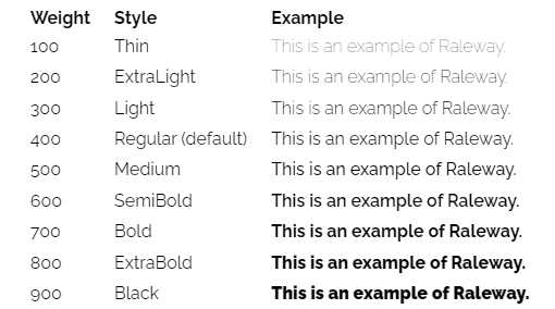
When selecting a typeface, consider how many font weights are available. Standard font weights range from 100 to 900, in multiples of 100. For example, the following are weights for the Raleway typeface from Google. Each of these font weights also has an italicized version:

Body Text Weights
The 400 weight for a typeface is considered regular text, but there are often alternatives. A 500 weight produces slightly chunkier text while a 300 or 200 weight looks lighter. Either 300 or 500 may work well for body text depending on the typeface and your needs.
Bold Text Weights
You are probably familiar with specifying a bold weight for a font like so:
font-weight: bold;
By default, bold refers to the 700 weight, but a font family may also include weights of 600 (semi-bold), 800 (extra bold), and 900 (black). I find semi-bold weights particularly useful for emphasizing text ever so slightly. When you specify bold text using the font weights, you can use the different weights as needed, such as semi-bold for headings and extra bold for figure and table captions. There’s a trick to this, though, which I’ll talk about in the next article.
Why Bother with Bold Weights?
Including the bold weight font files for a custom typeface may seem like a bother, but it makes a difference. Although a browser can create a bold weight from a regular weight by glomming extra pixels onto the text, the results look clunky. The browser’s on-the-fly modification can’t match the consideration given by a typographical designer.
Watch Out for Wingdings!
Managing fonts isn’t just about adding the ones you want to use. It’s also about removing sneaky ones that cause problems. I commonly see documents originally written in Microsoft Word or Adobe FrameMaker that use a symbolic font such as Wingdings. Font-based icons like these are often found in lists or tables:
With a symbolic font, each character is rendered as a symbol. In the HTML markup, the first character shown above is the letter “o” with a span style that specifies the Wingdings font:
<span style="font-family: 'Wingdings'">o</span>
The problem is that Wingdings is not standard outside of Windows. A PDF that includes Wingdings characters will render fine on any platform because it embeds the font. When you generate HTML, though, the Wingdings symbols shown above will look like the following on a device that does not have Wingdings installed:
That will definitely confuse your readers!
Working around Symbolic Fonts
There are three ways to work around the use of local symbolic fonts:
- Include the symbolic font with the HTML5 output, which I’ll demonstrate in the next article.
- Use a cross-platform symbolic font available through the Internet. Popular choices include Font Awesome and Google’s material symbols.
- Substitute icon images in the PNG, GIF, or SVG format.
Finding Local Fonts
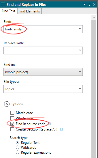
You can find instances of local fonts in a Flare project by searching for font-family in the source code (Home > Find and Replace):

Summary
When selecting typefaces, make sure that the font faces include enough weights to provide the flexibility of styling you will need. To make your typefaces available to all browsers on all operating systems, include font definitions with the Flare output. I’ll demonstrate how to do this in the next article.
Come back for part 2 next week!


