


.jpg?format=avif&q=60&w=600&h=427)
This guest post was written by Jay Slagle, an independent consultant and certified MadCap Software Advanced Developer who is passionate about using CSS to enhance the power of MadCap Flare. After discovering MadCap Software tools over a decade ago while working as a technical writer in Seattle, he has designed and implemented Flare projects for clients in government, law, education, healthcare, and technology. When he’s not occupied with all things Flare, Jay writes fiction under the pen name JB Strand.
Everyone knows that MadCap Flare allows you to publish the same content to different output formats such as HTML5 and PDF. When you do this though, you often need to adjust your CSS styles to manage the different output types properly. The more you understand how CSS functions in Flare, the easier it will be to take advantage of the features specific to each format. In this and subsequent articles, I'll pass along some tips for handling print formats, both PDF and the print format the browser uses when you print an HTML5 page. In this article, I'll look at basic issues with colors and images.
Print Styles — They're not just for PDFs
Should you care about developing print styles in CSS even if you don't publish PDFs? Absolutely! When a reader prints a topic from an HTML5 output, the browser uses the styles defined in the output stylesheet's print section. This gives you the ability to modify styles or hide elements that shouldn't be printed. Your reader will appreciate the extra effort you've taken to improve the experience.
The CSS Print Section
PDF layout is controlled by the stylesheet in conjunction with page layouts and PDF target settings (see in particular a PDF target's Advanced tab). In the stylesheet, you set up print styles in the stylesheet's print section, which is defined at the bottom of the stylesheet:
...Default styles at the beginning of the stylesheet`...
@media tablet
{
..._Tablet styles inherit values from the default section_...
}
@media mobile
{
..._Mobile styles inherit values from the tablet section_...
}
@media print
{
..._Print styles inherit values from the default section_...
..._Print styles do not inherit values from the tablet or mobile section_...
}`
Note: Like the tablet and mobile sections, the print section requires all markup to be enclosed in a set of curly braces.
Reducing the Amount of Color
It's often hard to know how frequently your readers print a topic page, whether from a PDF or an HTML5 output. If you think this is a common occurrence, consider the elements that use a lot of color, such as headers that use a branding color. Color elements can use up a lot of color toner. On monochrome printers, saturated yellows, oranges, greens and reds that look vibrant on the screen come out as different shades of gray that can skew too light or too dark. Color combinations that contrast well on the screen can look muddled when they print out gray, so you may want to modify these colors in the print CSS styles.
It's also a good idea to watch out for dark backgrounds used with light text (headings and note styles are common culprits). Consider reversing these paragraphs to dark text against a white background in print. Although the browser may reverse the colors automatically when the reader prints an HTML5 page, modifying the styles yourself gives you more control over the outcome. For example, a heading like this is eye-catching on a screen, but in print, a lot of these will chew through printer toner quickly:
In the Flare stylesheet, it's easy to modify attributes such as color and background-color for print. Borders can provide an effective replacement for color backgrounds because they impart blockiness without using a lot of color. Here's a screenshot of the preceding paragraph as it appears in PDF or an HTML5 printout:

The markup for the color swap is simple. Here's the default setting used in HTML5:
h3.reverse {
font-weight: bold;
font-size: 14.0pt;
padding: 8px 4px;
color: var(--YellowLight);
background-color: var(--GrayDark);
}
Here's the print setting:
@media print {
h3.reverse {
background-color: transparent;
color: var(--GrayDark);
border-top: 1px solid var(--GrayDark);
border-bottom: 1px solid var(--GrayDark);
}
}
Because print styles inherit attribute values from the main HTML section, you don't need to include values such as margins and padding in the print styles unless you need to override the settings used with your HTML5 outputs.
Images in Print
Flare is savvy about understanding the styles that don't work in print. For example, if you use image thumbnails, Flare knows that thumbnails don't apply to PDF outputs, so you don't have to worry about disabling the thumbnails when you generate a PDF. But it's often necessary to set other print styles for images, such as the maximum width.
Percentage Values for Max-width
As I mentioned in a previous article, it’s good insurance to set a max-width of 100% on the <img> tag to keep images within their boundaries. You can adjust that sizing for print image classes, but whenever possible use percentage values rather than absolute width values in pixels, points, inches or centimeters.
Percentage values not only allow the images to adjust automatically if you change the width of the text column in your PDF page layout, but they also accommodate indented images. For example, the following screenshot shows two images that use the same image class. The first image follows a standard paragraph, the second a bullet point:
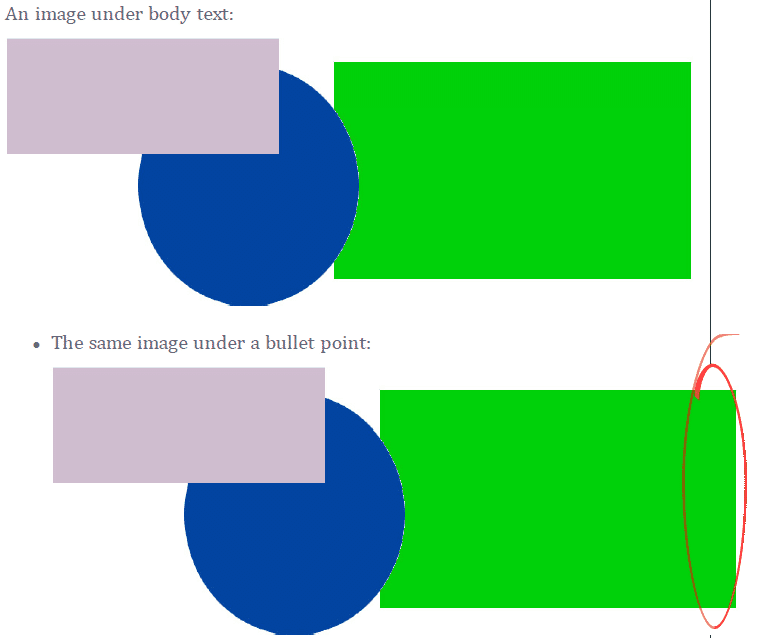
The thin black line at the right of the first image indicates the right boundary of the text column. Because the max-width value is set to an absolute value that equals the full width of the text column, placing the image in an indented paragraph causes it to overspill the right edge:
img.Landscape600px {
max-width: 6.25in;
height: auto;
}
Changing the max-width to a percentage value tells Flare that no image in this class can be wider than the element that contains it:
img.Landscape600px {
max-width: 99%;
height: auto;
}
So instead of being set to an absolute width, the maximum image width is relative to the indented paragraph that contains the <img> tag. In the following screenshot, you can see that the indented image renders a bit smaller, which keeps it from spilling over the right margin:
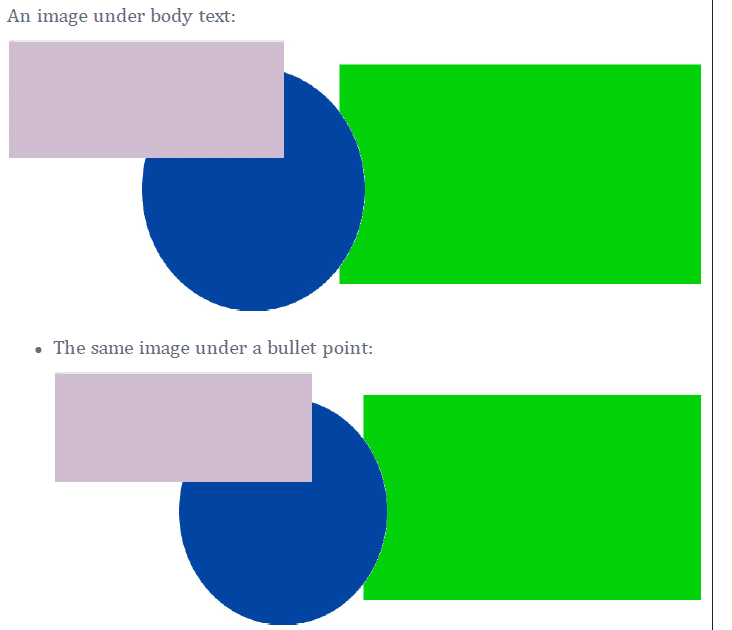
Image Size Strategies
Using CSS you can combine HTML5 image thumbnailing and PDF maximum sizing to craft a basic image strategy. I find it useful to define different classes for images that I categorize as small, medium and large.
HTML Image Thumbnails
In the default section of my stylesheet, I create three image classes. Each class defines an image thumbnail at a different width (200 pixels, 400 pixels, or 600 pixels). The popup image that appears when the thumbnail is clicked will expand to its normal size or as large as it can get given the screen width and height:
img.Landscape200px
{
    mc-thumbnail: popup;
    mc-thumbnail-max-height: auto;
    mc-thumbnail-max-width: 200px;
}

img.Landscape400px
{
    mc-thumbnail: popup;
    mc-thumbnail-max-height: auto;
    mc-thumbnail-max-width: 400px;
}

img.Landscape600px
{
    mc-thumbnail: popup;
    mc-thumbnail-max-height: auto;
    mc-thumbnail-max-width: 600px;
}
Print Image Sizes
In my print section, I use percentage values on these style classes to set maximum widths on the three classes so that they don't get too large:
@media print
{
   img.Landscape200px
   {
       max-width: 33%;
       height: auto;
   }

   img.Landscape400px
   {
       max-width: 66%;
       height: auto;
   }

   img.Landscape600px
   {
       max-width: 99%;
       height: auto;
   }
}
Note: For portrait-oriented images, it is often better to define a max-height. In this case, do not use a height attribute, but add a width attribute set to auto to keep the aspect ratio of the image correct.
Local Styling for Image Sizing in Print
In print outputs, image class maximum sizing is a blunt instrument. Some images that are constrained by the maximum size of an image class will still look too large on the printed page. In these cases, you can adjust image print sizes on a case-by-case basis. This is where local styling comes in. Even if you assign an HTML5 thumbnail class to the image, you can right-click the image and set a print size (do not set anything on the Size tab, which affects HTML):
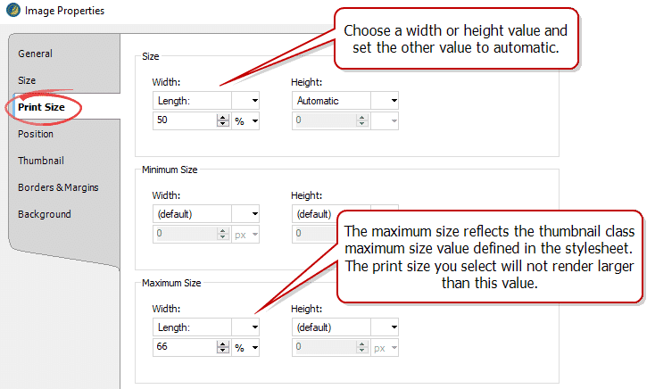
Using percentage-based widths in the local styling attributes provides flexibility if the column width in your print output changes. However, if you want an image to be an exact size in every print output, set that size using your measurement of choice, such as centimeters or inches.
Summary
With CSS print styling, you can adjust elements to make them better suited for printed outputs. You can also set up an overall strategy for managing image sizes in both HTML5 and printed outputs. Are your images mostly large screenshots? Are they a mix of small and large graphics? A close look at the types of images you use will lead you to an effective solution.


