


This guest post was written by Jay Slagle, an independent consultant and certified MadCap Software Advanced Developer who is passionate about using CSS to enhance the power of MadCap Flare. After discovering MadCap Software tools over a decade ago while working as a technical writer in Seattle, he has designed and implemented Flare projects for clients in government, law, education, healthcare, and technology. When he’s not occupied with all things Flare, Jay writes fiction under the pen name JB Strand.
In my previous article, I demonstrated some CSS methods for creating simple note styles consisting of a single paragraph of text. In this article, which concludes my series on hacking CSS in MadCap Flare, I will cover some techniques for creating note styles that include multiple paragraphs. Along the way, I'll review some of the CSS selectors and shorthand I've described in previous tutorials.
Tables or Divs?
A common method for creating multi-paragraph notes is to place the content in an HTML table. If you are generating PDF outputs, a table sometimes works better than a div because Flare does not support all possible CSS attributes in PDFs. But grouping paragraphs within a single div is generally faster and easier than creating a table. For instance, CSS can automatically set attributes that you must set manually with tables, such as setting a specific width for the note content and centering it in the text column. In short, using divs and CSS styling whenever possible can make the process of creating notes more efficient and consistent.
Simple Div Note Style
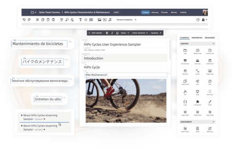
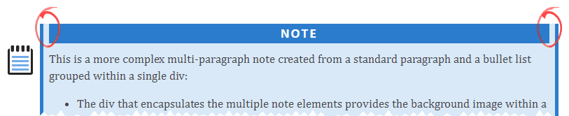
The following is a simple note style consisting of a single div that encapsulates a paragraph and a bullet list. You would create the note by selecting the content and choosing the div style using the Group button on the Flare Home ribbon:
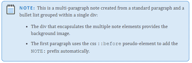
CSS Attributes for the Simple Note Div
These are the CSS attributes for the note body:
div.NoteSimple
{
    max-width: 650px;
    margin: 15pt auto;
    padding: 0px 15px 5px 60px;
    min-height: 40px;
    border: 2px dotted var(--BlueDark);
    border-radius: 10px;
    background-color: var(--BlueLight);
    background-image: url('../Images/NoteLarge.png');
    background-size: 30px auto;
    background-position: 15px 10px;
    background-repeat: no-repeat;
    page-break-inside: avoid;
}
If all of that markup makes perfect sense, you are really getting a handle on CSS! Nonetheless, let's review what each attribute does:
max-width: 650px;
Constrains the note to a maximum width of 650 pixels. This is an optional design element.
margin: 15pt auto;
Sets all four margins using CSS shorthand. The top and bottom margins are 15 points. The left and right margins are set to auto, which centers the note within its container, something that will be noticeable on large screens because of the max-width constraint.
padding: 0px 15px 5px 60px;
Pads the note content using CSS shorthand. The top padding is zero because the first paragraph in the note includes a top margin. The right padding is 15 pixels, the bottom padding 5 pixels. The left padding is 60 pixels to make space for the background image.
min-height: 40px;
Prevents the background image from getting cut off if the note contains a single line of text.
border: 2px dotted var(--BlueDark);
Sets the border style.
border-radius: 10px;
Rounds the border edges. The higher the value, the rounder the corners.
background-color: var(--BlueLight);
Sets the background color.
background-image: url('../Images/NoteLarge.png');
Provides the relative URL to the background image file.
background-size: 30px auto;
Changes the background image size. This is not needed if the image is already the size you want. If you plan to use the note for PDF outputs, use an image file set to the desired print size and resolution. Keep in mind that you can always change the note format in the print section of the stylesheet. You can specify a different image file than the one used in HTML5 outputs, for example, as well as change the note padding.
background-position: 15px 10px;
Positions the background image. The default position is the upper-left corner of the div. These values move the image 15 pixels to the right of the left border and 10 pixels down from the top border.
background-repeat: no-repeat;
Keeps the image from tiling across the entire div.
page-break-inside: avoid;
Prevents a page break inside the note in print outputs. For multi-column layouts, you can also include this:
column-break-inside: avoid;
CSS Attributes for the Note Prefix
The second part of the note markup adds and formats the NOTE: prefix:
div.NoteSimple > p:first-child::before
{
    content: "Note: ";
    font-family: var(--FontSansSerif);
    font-weight: bold;
    letter-spacing: 2px;
    color: var(--BlueDark);
    text-transform: uppercase;
}
This complex selector finds the first standard paragraph within the note div and adds the NOTE: text in front of it. This technique assumes that the first element in every note instance will be a standard paragraph. This feature is optional, and CSS provides plenty of alternatives. You can simply add the prefix text manually and apply a span to style the text. This may be easier if you want to use different prefix text for different notes, such as TIP, REMINDER, or WARNING.
Descendant Selector for Note Element Styles
Throughout this series, the most important concept I've covered is the use of descendant selectors to change style attributes in different contexts to avoid the proliferation of specialized CSS classes. If you want to change margins, font sizes, or line heights for elements within a note div, for instance, use one or more descendant selectors that select the note class and the containing elements. For example, if you want the note text to render in a different typeface, you may be able to use a descendant selector with a wildcard:
div.NoteSimple *
{
    font-family: var(--FontSansSerif);
}
The wildcard affects all content in the note, making it look like this:
This blanket approach does not always work well. Notice that the monospace spans become sans-serif as well. Because of CSS inheritance, the order of markup within the stylesheet can also affect the outcome. This means that you may need to create specialized selectors and place them at the end of the stylesheet's default section.
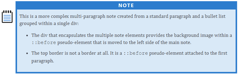
Complex Div Note Style
Once you become comfortable with CSS, you can create more complex styles. There is no single way to go about developing a complex style. It's all about imagining a design and then figuring out how to implement it using CSS. The following example tackles the problem that a div's background image cannot appear outside of its borders. Nonetheless, some fancy CSS saves the day:
CSS Attributes for the Complex Note Body
These attributes define the body of the complex note style:
div.NoteComplex
{
    margin: 15px 0 0 60px;
    padding: 0 8px 10px 8px;
    min-height: 70px;
    max-width: 80%;
    background-color: var(–BlueLight);
    border-bottom: 5px solid var(–BlueDark);
    border-left: 5px solid var(–BlueDark);
    border-right: 5px solid var(–BlueDark);
}
I will simply point out here that this div uses a large left margin (instead of the large left padding of the simple example) to push the div container 60 pixels to the right.
CSS Attributes for the Top "Border"
The attributes for the note body div create left, right, and bottom borders. The top border is an optical illusion. It's not a border at all, but rather a ::before pseudo-element attached to the first paragraph:
div.NoteComplex > p:first-child::before
{
    display: block;
    content: "Note";
    font-family: var(--FontSansSerif);
    font-weight: bold;
    font-size: 14pt;
    letter-spacing: 2pt;
    color: var(--White);
    background-color: var(--BlueDark);
    text-transform: uppercase;
    text-align: center;
    padding: 2px;
    margin: 4px -8px 10px -8px;
}
The tricks that make this work are the first and last attributes. The block display attribute makes the pseudo-element function like a separate paragraph. The margin attribute provides negative margins for the left and right side. If you look back at the CSS for the div container, you'll see that it has 8 pixels of padding on the left and right sides. Because the pseudo-element functions like a text paragraph, it will by default fit inside the div's padded content area:
However, an element can have negative margins (but not negative padding). The pseudo-element therefore has negative 8-pixel margins on the left and right to expand the element across the div's padded area, making it look like a top border. This is the essence of CSS hacking: finding the approaches and attributes that create the desired results.
CSS Attributes for the Note Icon
The icon for this note is created with a ::before pseudo-element attached to the containing div. Here, I make the pseudo-element float to the left and use the icon as its background image. The negative left margin pulls the icon away from the rest of the div content:
div.NoteComplex::before
{
    content: ' ';
    float: left;
    width: 48px;
    height: 48px;
    margin-left: -60px;
    margin-top: 30px;
    background-image: url('../Images/NoteLarge.png');
    background-repeat: no-repeat;
}
Notes on Using Complex CSS Markup
Although using complex CSS can greatly enhance your document design, there are a few gotchas to watch out for:
- Older browsers may not support all CSS attributes.
- Complex CSS-based constructions may not display perfectly in the Flare GUI. Always look to the HTML5 output to verify your design.
- Not all CSS attributes translate to PDF, so if you need to create print output, test your design thoroughly. Use the print section of the stylesheet to make changes as needed.
- You can encapsulate divs within divs like nesting dolls, each div adding a different aspect of the design. This can give you highly sophisticated designs, but it makes note styles more complicated for writers to create.
Summary
As I draw this series to a close, I hope that I have passed along some useful tips and have inspired you to add more complex CSS techniques to your Flare stylesheets. CSS is complicated, no doubt, but as you become familiar with its features, you can profoundly enhance the look of your Flare outputs while also improving your productivity. The secret to learning CSS is to give yourself room to practice, to fail, and to learn. Good luck and happy hacking!


