


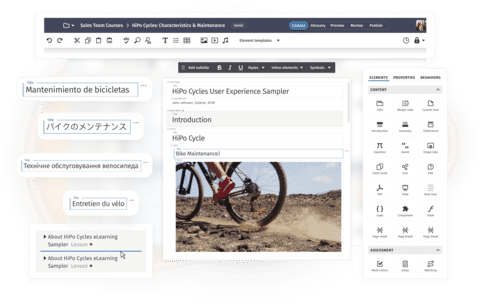


Jim is a seasoned technical writer with over 18 years of diverse experience, excelling in mobile and cellular networks, data quality systems, web development, and health and fitness software. His career began by developing device-specific online courses, nurturing sales team growth. Jim's expertise extends to creating user-centric solutions in help application development, utilizing tools like MadCap Flare. With a dual major in English and Chemistry, a Master's in Technical and Professional Writing, and 80 hours of doctoral work, Jim is committed to pushing the boundaries of technical communication and making complex information accessible.
Hi MadBlog readers! Today, I'm excited to share a unique and visually appealing approach to designing a typical Flare Menu Proxy that goes beyond the traditional unordered list and Flare skins. In this article, we'll dive into styling Flare TOC items to resemble HTML cards, providing a fresh and modern look for your documentation. At the end of this article, I’ve provided a Flare example project for you to use.
Concept
Flare's Menu Proxy is a very powerful tool that transforms an XML Table of Contents (TOC) into an unordered HTML list element. When creating a menu, we typically use a skin to create a custom look and feel. Flare provides us with the flexibility to apply custom styles to any list of items.
When TOCs become HTML list elements, we gain the ability to design and customize the appearance of each list item according to our preferences or corporate branding. It opens the door for enhanced visual appeal, better usability, and alignment with modern web development practices while maintaining single-source practices.
Design
Flare lets us seamlessly and creatively style TOC items using skins or coding CSS ourselves. For this particular project, I was asked to use HTML cards on the landing page and some other pages, so I initially began creating cards that linked to topics in my output. I found myself retyping topic titles I’d already created as a TOC. Somewhat frustrated, I continued while thinking, “How can I make cards act as TOCs, automatically updating the title while maintaining the link as TOCs do?”
The answer: Don’t. I’ve learned to work with Flare not against it, and I’m a fan of flip-flopping situations, so instead, I wanted a TOC to act as cards in my output.
TOCs may be one of the easiest tasks to accomplish in Flare, so the odds of success are already in favor! Let’s walk through the process.
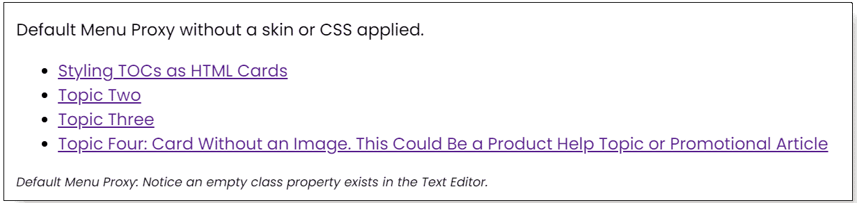
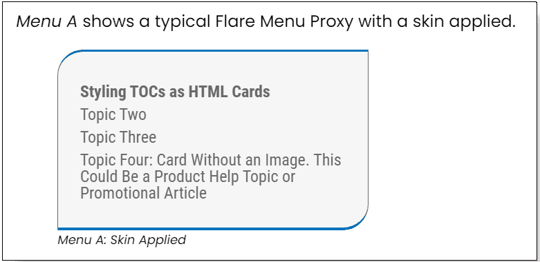
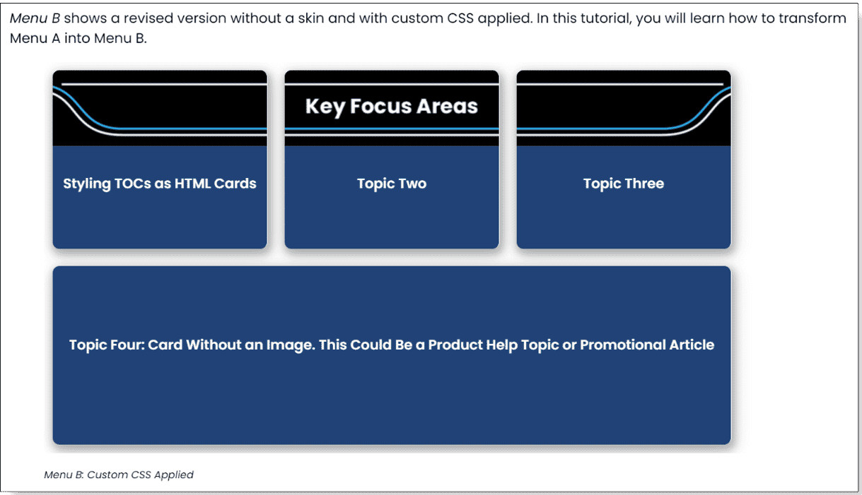
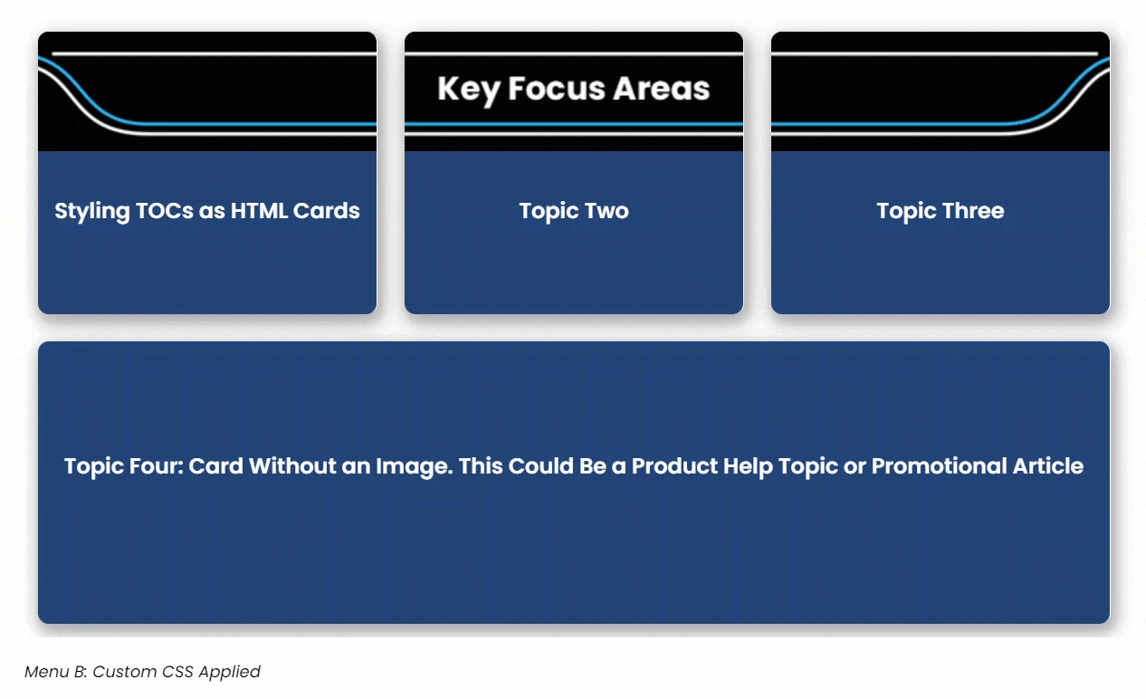
The following images show variations of the menu in HTML5 output. All three examples are Flare Menu proxies, and each proxy uses the same TOC. The first image is a default proxy without applying any customization. Menu A uses a skin. Menu B uses custom CSS instead.
Let’s learn how to accomplish this transformation.
Simple Start
To begin, download the example project and open it in Flare. You may want to build and view the output before creating your own. You can use the default topics already in the project or create some new topics. For this example, I used four.
When you’re ready, complete the following.
1. In the Project Organizer, right-click the TOCs folder and click Add Table of Contents.
2. Name the TOC myTOCforCards (or chose a different name) and click Add. The new TOC opens.
3. In the Content Explorer, drag and drop four topics to the TOC, making sure the entries are siblings and not inside a default book.
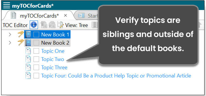
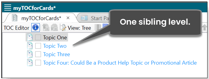
4. Select both books, right-click, and click Delete. You should have one level of topics.
5. Save the TOC and close it.
Next, we’ll insert a Menu Proxy component.
1. Open Topic One. And place the cursor below the placeholder text.
2. On the Insert ribbon, click Proxy > Menu Proxy.
3. Select myTOCforCards from the drop-down menu, deselect all options in the Context Sensitive section, and leave Menu Style as (default).
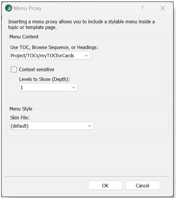
4. Click OK.
5. Click Text Editor to see the document’s code and copy this code to the clipboard: class="my-horizontal-Cards"
6. Place the cursor before the closing MadCap:menuProxy bracket, right-click, and click Paste. Maintain proper spacing.
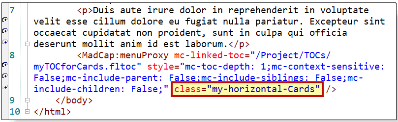
7. Click Save.
When you add a CSS class to a Menu Proxy, the class will override the default skin setting in the output. This is a key point to understand.
Custom CSS
Now let’s add some CSS! My preference is to apply most styles to the anchor element. To save time, we’ll copy and paste the code.
1. Right-click Styles.css and click Internal Text Editor.
2. Let’s assign some standards to our menu like removing the default bullets and horizontally aligning the list elements. Copy and paste this code into Styles.css.
ul.my-horizontal-Cards
{
     list-style-type: none;
     overflow: hidden;
     text-align: center;
     margin-left: auto;
     margin-right: auto;
     width: auto;
     background-color: transparent;
}
ul.my-horizontal-Cards li
{
     float: left;
}
3. Next, style the list items. Copy the following code and paste it into the stylesheet.
ul.my-horizontal-Cards li a /*This assigns some basic style properties to the list items. Customize these properties for your scenario.*/
{
     display: block;
     color: white;
     text-align: center;
     text-decoration: none;
     border-right: 1px solid #ffffff;
     border-radius: 8px;
     margin: 10px;
     transition: background-color 0.3s ease;
     background-color: #214377;
     font-family: 'Poppins SemiBold';
     box-shadow: 2px 4px 8px 3px rgba(0, 0, 0, 0.2), 2px 6px 20px 0 rgba(0, 0, 0, 0.19);
     box-sizing: border-box;
     padding-top: 90px;
     padding-right: 10px;
     padding-bottom: 10px;
     padding-left: 10px;
     width: 250px; /*If you’re using an image, you’ll probably want the image to be the same size as the width of the anchor item.*/
     height: 13rem;
}
Next, add a hover effect or animation for a more engaging experience.
ul.my-horizontal-Cards li a:hover /*Adds an effect on hover.*/
{
     background-color: #0073ba;
     animation: pulse;
     animation-duration: 1s;
}
In this example, animation: pulse; is an Animate class. Animate is one of my favorite free tools. You can learn more at https://www.animate.style.
For the first three list items, I’m including a header image. If you want to include an image in yours, simply use the nth child pseudo-class. The fourth item will not have an image.
4. Copy and paste the following code into Styles.css. Modify the background image reference as needed. Note the padding-top property adds spacing above the TOC entry (the title). Adjust it as needed.
ul.my-horizontal-Cards li:nth-child(1) a
{
     background-image: url('../Images/banner_blank_firstchild-250.png');
     background-repeat: no-repeat;
     padding-top: 120px;
}

 ul.my-horizontal-Cards li:nth-child(2) a

{
     background-image: url('../Images/banner_blank_middlechild-250.png');
     background-repeat: no-repeat;
     padding-top: 120px;
}

ul.my-horizontal-Cards li:nth-child(3) a
{
     background-image: url('../Images/banner_blank_lastchild-250.png');
     background-repeat: no-repeat;
     padding-top: 120px;
}
5. For the fourth card, I wanted it to be wider than the others. This code accomplishes that. If desired, add it to your CSS.
ul.my-horizontal-Cards li:nth-child(4) a
{
     width: 780px;
     padding-top: 120px;
}
6. Click Save
7. Build and View the output.
Now the menu items look like stylish HTML cards! A key point to understand is that you only need to update the TOC when you want to change the cards (unless you want to swap out color shades or images). What could be easier than simply updating a TOC?
One caveat exists that we should modify. By default, Flare assigns padding-inline-start: 40px; to the unordered list. When you transform the list to a horizontal layout, the 40 pixels remain on the first list item, meaning you cannot properly center the horizontal list. You must declare the property and set it to zero.
The <ul> should now resemble the following. Note the last property setting.
ul.my-horizontal-Cards
{
     display: block;
     list-style-type: none;
     overflow: hidden;
     text-align: center;
     width: auto;
     background-color: transparent;
     margin-block-start: 1em;
     margin-block-end: 1em;
     margin-inline-start: 0px;
     margin-inline-end: 0px;
     padding-inline-start: 0px;
}
Save the files and view the output. The animated GIF shows the hover effect.
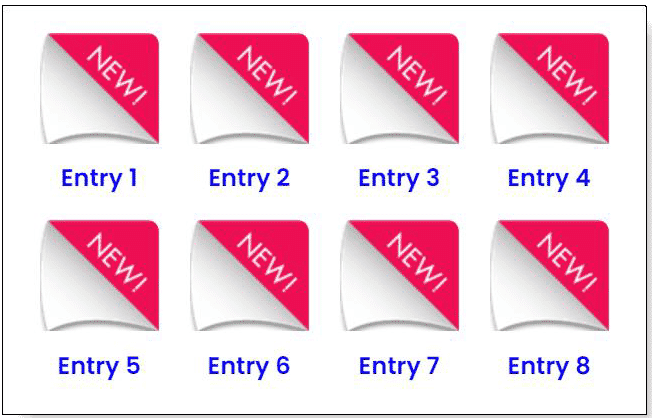
Many Icons Alternative
My stakeholders wanted an app-style button interface instead of cards. As a bonus, I have included the code here If you’re looking for an app-style choice of selections that’s styled as a grid of icons.
This is an example of a grid layout Menu Proxy.
Here is the CSS to apply a grid-style layout.
ul.longerlistTOC /*Styling for Many Icons*/
{
     list-style-type: none;
     overflow: hidden;
     text-align: center;
     margin-left: auto;
     margin-right: auto;
     width: 500px;
     background-color: transparent;
     padding-inline-start: 0px;
}

ul.longerlistTOC li
{
     float: left;
}

ul.longerlistTOC li a
{
     display: block;
     color: blue;
     text-align: center;
     text-decoration: none;
     border-right: 1px solid #fff;
     border-radius: 8px;
     margin: 10px;
     font-family: 'Poppins SemiBold';
     box-sizing: border-box;
     padding-top: 85px;
     padding-right: 10px;
     padding-bottom: 10px;
     padding-left: 10px;
     width: 80px;
     height: 74px;
     background-image: url('../Images/appIcon.png');
     background-repeat: no-repeat;
     margin-bottom: 20px;
}
There you have it! You’re empowered to create stylish HTML cards using a TOC and Flare’s powerful Menu Proxy component.
Bonus Tips!
1. Because Flare’s browse sequence files have the same XML structure as a TOC, you can use this same approach with a Browse Sequence Proxy.
2. One-level TOCs work best with this approach, but you’re definitely not limited to a single level structure.
3. Horizontal list elements are responsive and stack vertically when the browser view changes from desktop to mobile.
Customize the CSS for your vision. I will enjoy seeing the designs you create. This creative approach not only enhances the aesthetics but elevates the overall user experience of your Flare documentation.
Plus, what could be easier than creating a TOC in Flare?
Give it a try, and let your TOCs shine as stylish HTML cards! Download the Flare project.


