


This guest post was written by Matthew Ellison who runs UA Europe, an independent UK-based company that specializes in user assistance design and development. He has over 30 years of experience as a user assistance professional, including a period in the US as Director of the WritersUA Conference. Matthew is a MadCap Flare Certified Instructor and regularly presents training on Flare for students in Europe and other parts of the world. He is a past winner of the Horace Hockley award that is presented annually by the Institute of Scientific and Technical Communicators (ISTC).
Introduction to Landing Pages
Landing pages are important because they are often the first pages of your documentation that users see. The documentation home page is an obvious example, but a typical online documentation set contains a number of other landing pages that provide access to specific themes, features, or related tasks for your product. These typically sit at the second or lower level of the navigation hierarchy, and we can think of them as being stem or branch topics within the TOC tree structure. However, they are often used as the target of context-sensitive links or as featured snippets in search results, and can therefore play a vital role as a launch point for users.
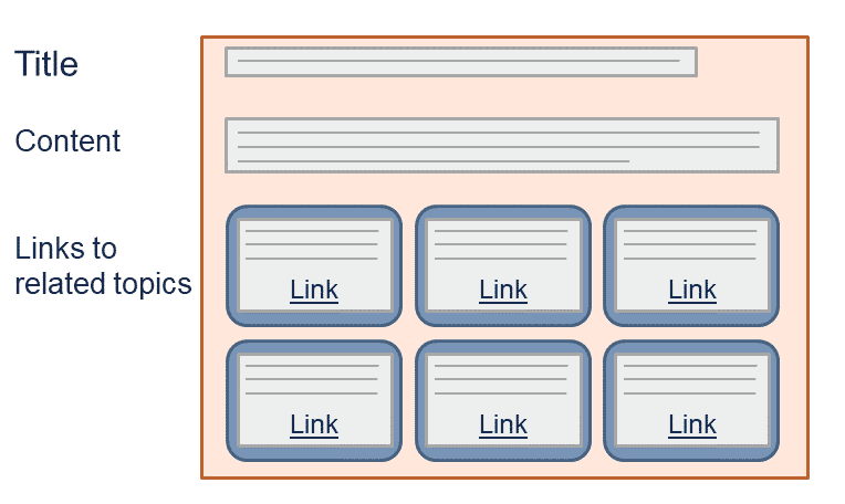
The main function of landing pages is to direct users to the information and answers that they are seeking. For that reason, landing pages usually contain at their core a set of links to other related topics, as shown in this diagram showing the basic structure of a typical landing page.
If the content within the landing page makes following a link unnecessary, all the better: this can potentially save users valuable time. Writers at IBM coined the term "Keystone Concept” for such landing pages. The idea was that these pages would provide access to a self-contained group of related task, concept and reference topics; but importantly the Keystone Concept topic would itself contain useful content that was designed to address the most common questions and issues.
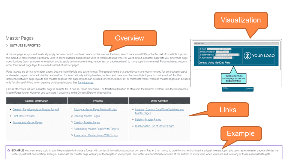
MadCap Software's own online Help for MadCap Flare (and other solutions) provides some great examples of landing pages that include useful content as well as, acting as a navigational conduit to further information. The following example can be accessed through the table of contents by selecting “Step 3: designing” and then “Master Pages”. I have identified the various components of the page with callouts.
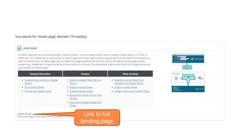
A slightly reduced version of the same page is also used as a Micro Content Response, and is shown as a featured snippet in response to a search query of “Master Page”:
Tile-based Layout for Landing Pages
Since the key role of landing pages is to provide links to other pages, the presentation of the links is critical. They need to be:
- Clear and self-explanatory – the link text should contain enough words to convey effectively the nature and purpose of the destination page. Icons can be useful to provide visual clues, and these are often used on homes pages or dashboards.
- Easy to select – the link should be physically large enough and sufficiently separated from other links.
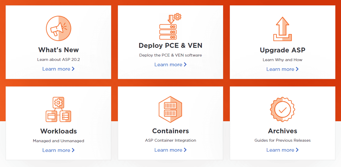
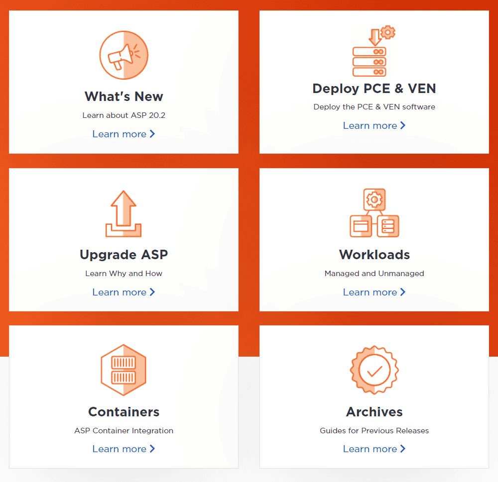
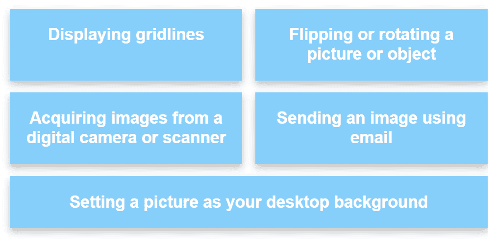
As a result of these requirements, a grid of tiles has become a popular design pattern. The tiles should be well defined with clear borders, sufficiently separated, and be arranged in a way that suits the available screen width. Here is an example, showing first how it appears on a full-size computer screen, and secondly how the layout is changed on a tablet screen.
Techniques for Fluid Layout of Tiles
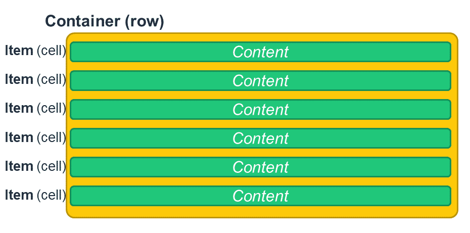
There are two alternative CSS techniques for creating a tile layout that adapts automatically to different screen sizes. These are Responsive Layout, and CSS Flexible Box Layout (commonly shortened to Flexbox). They both enable you to control the side-by-side positioning of content items (Flare calls these "cells" but they are actually div elements) within a container div (which Flare calls a "row"), as shown in the diagram below.
Responsive Layout
This is based on standard HTML and CSS techniques that have been available for many years and has widespread support even amongst older browsers such as Internet Explorer. Responsive Layouts are fully supported by Flare, and Flare provides a special Responsive Layout window pane that makes it possible to create the required HTML and CSS code without needing to use a text editor.
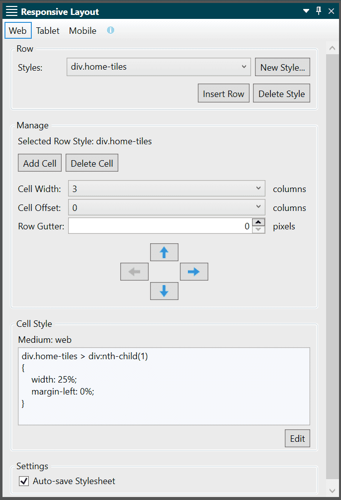
A fundamental aspect of Responsive Layouts is that you define a different layout for each of the three media types: Web (large screen), Tablet (medium-sized screen), and Mobile (small screen).
For help on this feature, see MadCap Flare’s help topic on responsive design.
Flexbox
This is a relatively new technology that is potentially more powerful and flexible than Responsive Layouts. Because it uses new CSS3 properties, it is not supported by older browsers, and Flare's own Editor does not render Flexbox layouts correctly. However, if you know that your customers are using modern browsers, the lack of support by Flare's Editor should not deter you from using it -- the Flexbox layout will be correct both in Flare's Preview window and in the generated HTML5 output. Note that it cannot be used successfully in PDF output.
Rather than defining different layouts for each of the three main media types, Flexbox responds in a continuous manner to changes in screen size, and there are no defined "break points".
For further information about Flexbox, refer to this complete guide to Flexbox.
Defining the Outline of Tiles
We've already discussed the importance of clearly defining the background or outline of tiles to make it as easy as possible for users to select the desired option on a landing page. There are three useful CSS properties that you can use for this:
- background-color
- border
- box-shadow
As an example, you might configure the format and layout of all of your tiles by adding these properties into the code created by the Responsive Layout window within your stylesheet:
div.home-tiles > div
{
background-color: #87cefa;
color: white;
border: 1px solid black;
box-shadow: 0 5px 10px rgba(0,0,0,0.25);
}
To make users fully aware of the option they are about to select, it is common to use a hover effect that emphasizes the outline as users move their mouse over a tile. You can do this using the :hover pseudo class; here is an example that increases the border width and deepens the shadow effect:
div.home-tiles > div:hover
{
border-width: 3px;
box-shadow: 0 12px 24px rgba(0,0,0,0.5);
}
Note that the :hover pseudo class will have no effect on mobile devices that have touch screens instead of a mouse pointer. On the subject of mobile devices, it is particularly important to ensure that tiles are large enough and sufficiently separated for both tablet and mobile media, since tapping with a finger can be less precise and accurate than clicking with a mouse. I also like to ensure that the entire tile is selectable, rather than just the link text within it – this makes it easier to tap with a finger.
Making Entire Tile Selectable
One way to make the entire area within the border of a tile selectable is to include all the content of the tile (including link text, icon, and any additional detail) within the link, and then to change the display property of the link from its default value of "inline" to "block". As a result, the link fills the entire tile. You will also want to make sure that the div representing the tile has no padding, as that would cause an inactive zone within the border of the tile.
I have done this using the following sample CSS code:
div.home-tiles > div > a
{
display: block;
padding: 1em;
}
…and HTML mark-up of this form:
<a href="destination_topic.htm">
<h2>Tile Heading</h2>
<p><img src="tile_icon.png" /></p>
<p>Tile description text</p>
</a>
Using Flare's XML Editor, it is not possible to insert a link that spans more than one block, so you will need to edit the topic using the Text Editor tab in order to place the opening and closing a (link) tags around the content of the tile.
Using Proxies to Automate the Links
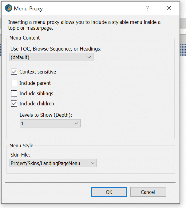
Landing pages are represented in the TOC as a Book item that groups together a set of child items. Typically the landing page topic itself provides links to all of these child items, and if this is the case, then it is possible to automate the creation of the links by using either a Mini-TOC Proxy or a Menu Proxy (with the Context-Sensitive option selected).
My preference these days is to use a Menu proxy as it is more flexible and results in cleaner code that is easier for me to format using CSS. To insert links to all the first-level child topics, you would configure the Menu Proxy in this way:
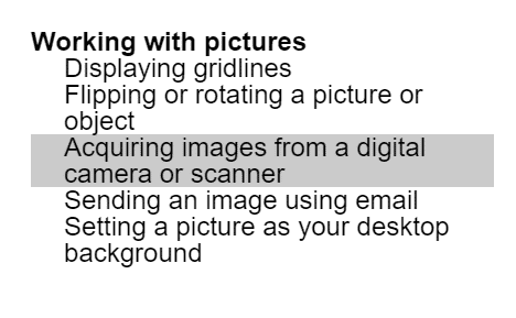
Of course, the default presentation of the Menu Proxy in the output is as a set of regular text links, arranged as a simple vertical list, like this:
However, the underlying HTML structure of the list is a ul element with child li items, which corresponds to the same container/child structure of a Responsive Layout or Flexbox Layout. It is therefore possible, using a combination of a Menu skin component and additional custom CSS, to present a Menu Proxy as a set of tiles with all the properties (including border, shadow, and mouseover effect) described above.
Here is an example block of CSS code that shows how this could be done. Please note that this code assumes that a Menu skin component named “LandingPageMenu” has been applied to the Menu Proxy:
._Skins_LandingPageMenu > .has-children > a
{
display: none;
}

._Skins_LandingPageMenu > .has-children > .sub-menu
{
display: flex;
flex-wrap: wrap;
}

._Skins_LandingPageMenu > .has-children > .sub-menu > .tree-node-leaf
{
flex-basis: 16em;
flex-grow: 1;
margin-top: 1em;
}

._Skins_LandingPageMenu > .has-children > .sub-menu > .tree-node-leaf > a
{
display: block;
height: 100%;
box-shadow: 0 5px 10px rgba(0,0,0,0.25);
transition: all 0.3s;
}

._Skins_LandingPageMenu > .has-children > .sub-menu > .tree-node-leaf > a:hover
{
box-shadow: 0 12px 24px rgba(0,0,0,0.5);
}
And here is how the resulting Menu Proxy might be presented as a result:
Please note that context-sensitive Menu Proxies do not work within a Micro Content Response because the Micro Content Response has no location within the TOC. So, if you are planning to re-use a landing page as a Micro Content Response, you will need to insert each of its links as individual hyperlinks or cross-references.
Master Pages
We can take the automation of landing pages further by including the Menu Proxy within a Master Page, and then applying the Master Page to all landing pages. The big advantage of this approach is that if, in the future, you need to change the configuration settings of the Menu Proxy, you need only do this once within the Master Page.
Conclusion
Landing pages should be a key component of your documentation navigation strategy, and it is worth investing significant time and effort in their design and creation. In addition to their main role of directing users to other topics, they can also add value by providing nuggets of information such as short videos or FAQs that make it unnecessary in many cases for users to follow the links.
Landing pages need to be easy to use on a range of screen sizes and devices, and you can use either Responsive Layouts or Flexbox to create a grid of tiles that changes automatically in layout to suit the dimensions of the screen.
The links on landing pages can potentially be added automatically through the use of a Menu Proxy in your Master Page, and you can even format these automatically-added links so that they are presented as easy-to-select tiles. For additional tips on how to enhance your landing pages and make them work brilliantly on a range of devices, watch my recent webinar on Techniques for Great Landing Pages. In addition, you can reference the sample Flare project mentioned in the webinar here.


