


MadCap Flare's Side Navigation and Top Navigation menus are useful ways for a user to find their way through a Flare-generated output, but sometimes authors want to go above and beyond these navigation features to provide a branded look for interactive buttons as well.
There are a couple of common ways to improve user navigation, such as building landing pages which by design focus less on content and more on connecting users to certain sections of content within the site. Other times, topics might logically link to another topic that a user should see.
In either of these scenarios, it's useful for users to have large, obvious buttons to help convey them to another location.
That's why we've put together a few different HTML buttons for your HTML5 Flare sites. You can use them as-is, or use them as a starting point and customize them to your needs.
Whether you want something that matches the modern design of large, flat, bright-colored buttons or a more dimensioned look and feel to give your page some "pop", we've got some designs to get you started. In this article, we provide both the HTML elements and the CSS code for three buttons that you can copy and paste directly into your Flare project style sheet, and a few tips on customizing them.
Modern Flat Button
The first button example we've provided follows the popular modern web design standards of a large, flat, brightly-colored button. The example includes a border radius to round off the edges, but if you prefer to stick with pointed rectangular corners, you can remove the property or reduce the radius to zero.

HTML Code
<a class="Button1" href="PUT YOUR LINK FILEPATH HERE">Button 1 Text</a>CSS Code
/*---Button 1---*/
a.Button1 {
  background-color: #00bfff;
  border-radius: 4px;
  color: white;
  margin: 15px;
  padding: 15px;
  font-weight: bold;
  text-decoration: none;
}

a.Button1:hover {
  background-color: #6495ed;
}

a.Button1:active {
  position: relative;
  top: 2px;
  left: 1px;
}
Popped Shadow Button
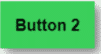
The second button example we've included is similar to the first with a couple of adjustments so the button appears to hover over the page with a slight shadow. Then, once depressed, it loses the shadow, as if pushed "into" the layer of the page, adding a nice interactive 3-D effect for users.
HTML Code
<a class="Button2" href="PUT YOUR LINK FILEPATH HERE">Button 2 Text</a>CSS Code
/*---Button 2---*/
a.Button2 {
  margin: 15px;
  padding: 15px;
  box-shadow: 5px 5px 10px grey;
  background-color: #00ff00;
  font-weight: bold;
  text-decoration: none;
}

a.Button2:hover {
  background-color: #7cfc00;
}

a.Button2:active {
  position: relative;
  top: 2px;
  left: 1px;
}
Responsive Button Array
Finally, we’ve put together a more complex example, which leverages Flare’s Responsive Layout grid with some modifications so that the usual cell <div> elements are instead <a> elements styled as buttons. This allows us to contain whatever text we want on the button while having the entire region act as a clickable link.
For those who are interested in extending or modifying the two-button array we have provided here, the trick we used was essentially just to
- replace the cell <div> elements in a Responsive Layout row with a similar <a> element as was used in the other two button examples above
- added a <span> element for each button’s text and styling to be applied properly
To update the CSS selectors Flare automatically provides for the Responsive Layout row we created, we made sure the complex selector in the stylesheet reflects the same pattern as the HTML elements. That way, the styles we choose are correctly targeted for the HTML elements we placed in our topic.
HTML Code
<div class="ButtonArray">
    <a href="PUT YOUR LINK FILEPATH HERE"><span class="Button">BUTTON 3A</span></a>
    <a href="PUT YOUR LINK FILEPATH HERE"><span class="Button">BUTTON 3B</span></a>
</div>
CSS Code
/*---Button 3---*/
div.ButtonArray    /*This is a custom responsive layout row style (div class) in your stylesheet. To provide your own description for this style: (1) Open the stylesheet; (2) Find and select the div class with this name; and (3) In the Comment field, replace this text with your own. For more information on adding comments to styles, see the online Help.*/ {
  mc-grid-row: true;
  margin-left: auto;
  margin-right: auto;
  margin-bottom: 20px;
  margin-top: 20px;
}

div.ButtonArray::before {
  content: " ";
  display: table;
}

div.ButtonArray::after {
  content: " ";
  display: table;
  clear: both;
}

div.ButtonArray span {
  float: left;
  -moz-box-sizing: border-box;
  box-sizing: border-box;
  background-color: #f6ae2d;
  height: 70px;
  text-align: center;
  padding-top: 20px;
  color: #ffffff;
  font-size: 18pt;
  font-weight: bold;
}

div.ButtonArray > a:nth-child(1) > span {
  width: 25%;
  margin-left: 16.667%;
}

div.ButtonArray > a:nth-child(2) > span {
  width: 25%;
  margin-left: 16.667%;
}

/*The @media queries below allow our button array to respond to changes in the display window's width*/
@media tablet {
  div.ButtonArray > a:nth-child(1) > span {
    width: 25%;
    margin-left: 4.166667%;
  }

  div.ButtonArray > a:nth-child(2) > span {
    width: 25%;
    margin-left: 8.3333%;
  }
}

@media mobile {
  div.ButtonArray > a:nth-child(1) > span {
    width: 100%;
    margin-left: 0%;
    margin-bottom: 30px;
  }

  div.ButtonArray > a:nth-child(2) > span {
    width: 100%;
    margin-left: 0%;
  }
}

span.Button {
  text-align: center;
  background-color: #f6ae2d;
  box-sizing: border-box;
  color: #ffffff;
  float: left;
  font-size: 18pt;
  font-weight: bold;
  height: 70px;
  -moz-box-sizing: border-box;
  padding-top: 20px;
}

span.Button:hover {
  color: #d3d3d3;
  background-color: #eb9c0a;
}

span.Button:active {
  position: relative;
  top: 2px;
  left: 1px;
  background-color: #f8c462;
}
Keep in mind that all of these are just starting points! Any of the properties you find and wish to change can be added or eliminated, including colors, shadows, button click effects, and more.
If you need help locating these CSS rules in your stylesheet, make sure to check the Complex Selectors dropdown in the Stylesheet editor for any of the selectors that you might be having a tough time finding. Alternatively, the Stylesheet file can be opened in a text editor mode for direct edits by right-clicking the CSS file in your Content Explorer, then clicking Open with… > Internal Text Editor.
Tip: While it may feel daunting to look at code in a text editor at first, this is one of the easiest ways to insert the CSS code above in your stylesheet.
Do you have ideas on styling buttons to share? Drop us a note below!


