


This guest post was written by Matthew Ellison who runs UA Europe, an independent UK-based company that specializes in user assistance design and development. He has over 30 years of experience as a user assistance professional, including a period in the US as Director of the WritersUA Conference. Matthew is a MadCap Flare Certified Instructor and regularly presents training on Flare for students in Europe and other parts of the world. He is a past winner of the Horace Hockley award that is presented annually by the Institute of Scientific and Technical Communicators (ISTC).
“Responsive” is a term we use in Web development normally to describe content layout and formatting that changes automatically based on the screen size of the device on which it is displayed. In the context of this article, however, I propose to consider responsiveness as a broader concept that enables us to adapt not only the format but also the content itself to the specific needs of the user.
We are all users of documentation in our daily lives. For example, only yesterday I received delivery of a pair of Smart Light Bulbs for my home and followed the accompanying set of printed instructions to add the lightbulbs to my home Wi-Fi network and make them controllable from my Amazon Echo speakers. One of the problems with such instructions is that, not only are they provided in about 10 different languages (meaning that the vast majority of the printed booklet is not relevant to me) but they are also designed to cater to a range of different light bulbs and for two different Home Hub systems (Google and Amazon). As a result, the instructions are written in a somewhat generic way, referring to “the product” instead of the specific bulb that I have purchased, and providing many different alternatives throughout the steps, depending on which of the Home Hubs I am using. Instructions that include information not relevant to me run the risk of being longer and more complex than they need to be for my specific situation – and, as a result, potentially intimidating and confusing. Furthermore, I find myself having less confidence that the information is accurate, relevant, and useful when it is written in such a general way.
The solution, of course, is to write content that is specific to the individual needs of each user, which, of course, is neither cost-effective nor practical in the case of printed instructions distributed with mass-produced products. However, in the case of HTML-based documentation generated from MadCap Flare, there is a wide range of techniques that we can use to make our content leaner and more relevant to the needs of each user.
Read More: What is Information Architecture? A Guide for Technical Writers
If you already use MadCap Flare, you will almost certainly be familiar with the technique of configuring separate targets within the same project in order to generate documentation for different audiences or for different models or versions of the same product. Through the use of conditions, we can customize the different outputs by including or excluding specific content, and we can redefine variables such as product names so that the documentation refers to the specific product the user is interested in. So, we already know that we can create different customized documentation sets from the same source.
But what if we need to create a single set of documentation (using just one target) that adapts dynamically to the needs of users? This would avoid the need to generate separate documentation sets (with different URLs) for users with different needs. In this blog post, I plan to focus on five such techniques. I’ll be providing examples of some of the techniques from a recent project that I have been involved with, which resulted in this documentation portal:
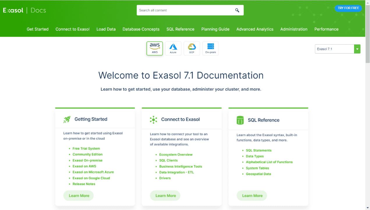
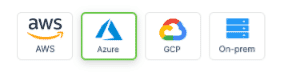
A key aim for this project was to provide a customized experience for each user, depending on which platform (AWS, Azure, GCP, or On-premise) they were running the Exasol database.
Snippet Conditions and Variables
This technique involves customizing the content of snippets within individual topics by:
- Redefining variables used with the snippet
- Excluding or including conditions that have been applied within the snippet.
As a result, we can potentially insert the same source snippet into four different topics, and have it show different information in each. While this does not, in itself, provide a way of having content change dynamically, it does enable us to customize re-usable content in ways that would otherwise require separate targets. This potentially enables us to make the content more detailed and relevant, without sacrificing content re-use — all in all resulting in a more impactful content strategy.
In the Exasol project, we used a single snippet as the source for each platform-specific topic within the Administration section of the Help. So, each of the following topics is actually sourced (including the topic headings) from the same snippet, with all variations in content being handled by Snippet Conditions and Snippet Variables:
https://docs.exasol.com/administration/aws/manage_storage/create_remote_archive_volume.htm
https://docs.exasol.com/administration/azure/manage_storage/create_remote_archive_volume.htm
https://docs.exasol.com/administration/gcp/manage_storage/create_remote_archive_volume.htm
https://docs.exasol.com/administration/on-premise/manage_storage/create_remote_archive_volume.htm
The result of this strategy is a set of topics that each focuses on the individual platform of interest to the user. And the topics are quicker and easier for the authors to maintain due to the single source snippet for each group of four topics.
Responsive Conditions
Responsive conditions are conditions based on the different screen sizes (Web, Tablet, Mobile) on which the content might be displayed. By marking up a piece of content with the Web condition, for example, we can ensure that the content is hidden automatically on a Tablet and Mobile screen. This enables us, for example, to create additional detail for users on a larger screen that is automatically removed on mobile devices, thus streamlining the user experience on a smaller screen. Or we could even use this technique to dynamically customize the terminology that we use within instructions, depending on which type of screen the instructions are displayed. This technique is explained in full within the following topic in Flare’s online Help:
We did not use responsive conditions within the Exasol project because analytics showed that the Exasol documentation is displayed and read predominantly on a larger screen, such as that of a computer.
Web Storage
In an ideal world, we might choose personalized content or documentation for different groups of users based on their login details. But the fact that documentation generated from Flare is essentially a static HTML-based site with no underlying server-side database or processing, makes this challenging. As an alternative, we could ask users to choose their own preferences, and then use those selections as a way of filtering and customizing the information we display to them. I’ll say more about techniques for filtering in the following sections.
How can we store the selection that users make so that the customized experience based on their preferences persists even into future browser sessions? The answer is Web Storage, a feature that is available in every modern browser window. It enables us, using a script, to store information as variables, and then to retrieve it as required. If we use the LocalStorage object that is available within Web Storage, the information is stored permanently unless the user explicitly clears it within their browser options. There are few privacy issues since the information is held and processed only on the user’s local computer, and is not made known to the server that is serving the Web pages.
In the case of the Exasol documentation, we provide four buttons within the platform-specific topics that enable the user to select their preferred platform.
When the user clicks a button, a script stores the corresponding platform name in a LocalStorage with a key of “platform”. This can then be used by other scripts that handle the filtering of the content and navigation. Because the selection is held in LocalStorage, it is remembered for all topics and for all future browsing sessions – which means that the user is only required to choose their preference once. From that point on they receive a customized content, navigation, and search experience based on their chosen platform.
The script commands for storing and retrieving data using the LocalStorage object are very simple. Here are examples of commands for storing and retrieving the user’s choice of platform:
// Store (used when the user clicks a platform button)
localStorage.platform = "azure");
// Retrieve (used by the scripts that filter based on chosen platform)
localStorage.platform;Search Filters
Flare supports search filtering based on Concept Keywords that have been applied to topics and a Search Filter Set that defines the specific Concept Keywords on which the search filter will be based. For more background information on Search Filters, see the following topic in Flare’s online Help:
In the Exasol project, we used a Concept Keyword for each of the four available platforms. A topic that is specific to Azure, for example, is given the “azure” keyword. Topics that are applicable to all platforms are given all four of the keywords. We also defined a Search Filter Set that associated each of the four keywords with a different filter name, and selected this Search Filter Set in the target.
Normally, you might have expected the search filters to be available from a button on the search bar, in the same way as it is within MadCap Flare’s local documentation:

However, we suspected that users may not notice or understand this button, and we chose instead to apply the filter automatically based on the user’s chosen platform (which is stored in LocalStorage). So, we hid the Search Filter button on the search bar and wrote our own script to apply the search filter. This is easier than you might think because a filter can be applied simply by appending an &f parameter to the address for the Search Results page. For example, the following address applies the “azure” filter to a search for “archive volume”, resulting in a list of search results that do not include any of the GCP, AWS, and On-premise topics:
https://docs.exasol.com/search.htm?q=archive%20volume&f=azure
CSS Filtering of content
Using CSS, we are able to dynamically filter out content from topics that are not relevant to the needs of the user. For example, the home page for the Exasol documentation displays different content within its Administration section (scroll down the topic to see this), depending on which platform the user has selected:
https://docs.exasol.com/home.htm
There are actually four different pieces of content within the Administration section of the Home page, each with a different class name (“aws”, “azure”, “gcp”, or “onPremise”). Only one of these pieces of information is shown, depending on which platform has been selected by the user.
We achieved this by using a script to add a CSS class name (matching the platform selected by the user) to the body element of the page. So, for example, when the user has selected “Azure”, the source HTML code of the page now contains:
body class=”azure”Given that all the other elements on the page are nested within the body element, we can filter out unrequired classes by using standard CSS Descendant Selectors within our stylesheet. For example, the result of this style rule is that when the body element has a class of “azure”, any elements with classes of “gcp”, “aws”, or “onPremise” on the page are not displayed:
body.azure .aws,
body.azure .gcp,
body.azure .onPremise
{
	display: none;
}
I find Descendant Selectors to be an extremely powerful and helpful feature of CSS, and I use them frequently. For more information about them, see:
CSS Filtering of Navigation
We can extend the technique described in the previous section to filter out unrequired or irrelevant items from the navigation menus. For example, you will see in the Exasol documentation that when the Azure platform has been selected using the button, the TopNav Administration menu shows only Azure-related topics. This list of items on the menu changes when you select any of the other three platform buttons.
In order to filter out menu items, we need to be able to apply a class name (“aws”, “azure”, “gcp”, or “onPremise”) to each of them. We can do this using the “Style Class” attribute in the Properties dialog for each TOV item:
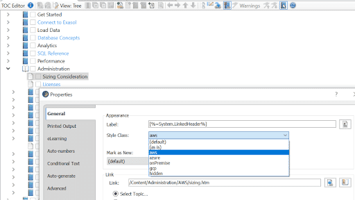
The list of available names in the drop-down list of Style Classes is populated by adding them to the main Skin used by your project. It is not possible to add these using the Skin Editor, and you will need to open the skin and add the class names using a Text Editor. They belong in the <Styles> section, and need to be enclosed within a <Style> element that has a Name attribute of “TocEntry”, as in the following example:
<Style
        Name="TocEntry">
        <Classes>
          <StyleClass
            Name="aws"
            Custom="true"></StyleClass>
          <StyleClass
            Name="azure"
            Custom="true"></StyleClass>
          <StyleClass
            Name="onPremise"
            Custom="true"></StyleClass>
          <StyleClass
            Name="gcp"
            Custom="true"></StyleClass>
        </Classes>
      </Style>
Once you have applied style classes to TOC items, they can then be filtered out of the Side or Top Navigation menus by using a Descendant Selector such as the one given in the previous section.
Conclusion
Out of the box, MadCap Flare provides a range of features and techniques for customizing and filtering content. Flare’s built-in features can be further extended by adding your own custom scripts and CSS. These, when combined with the LocalStorage object as a way of storing user preferences, can provide a powerful set of tools for making your content layoutleaner, more relevant, and potentially even personalized to the needs of individual users.

