


This guest post was written by Jay Slagle, an independent consultant and certified MadCap Software Advanced Developer who is passionate about using CSS to enhance the power of MadCap Flare. After discovering MadCap Software tools over a decade ago while working as a technical writer in Seattle, he has designed and implemented Flare projects for clients in government, law, education, healthcare, and technology. When he’s not occupied with all things Flare, Jay writes fiction under the pen name JB Strand.
Creating visually striking styles for note, tip, and warning paragraphs is a great way to highlight important information and liven up your MadCap Flare documentation. In this article, I'll show you how to use CSS pseudo-elements, borders, and background images to design single-paragraph notes for HTML5 outputs. You may be surprised at how much stylistic panache you can add to a paragraph style without resorting to layout techniques like tables and divs.
Classic Autonumber Approach
A common method of creating note paragraphs in Flare (one you may be familiar with if you've ever used Adobe FrameMaker) is to use an autonumber. Instead of specifying a numbering scheme, the autonumber simply adds a text prefix such as "Note" to the paragraph:
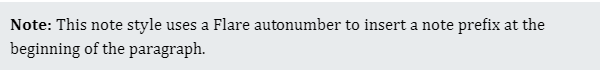
This type of note style includes the Flare attribute mc-auto-number-format to define the text and provide basic formatting such as bolded text:
p.Note {
width: 600px;
padding: 10px;
background-color: var(--GrayExtraLight);
mc-auto-number-format: '{b}Note: {/b}';
}
CSS "Before" Pseudo-Element
CSS provides an alternate way to do this through pseudo-elements. The ::before pseudo-element adds content before the actual paragraph text. You can easily use it to insert a prefix as in the previous example:
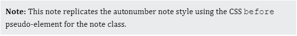
For the main element class, omit the Flare mc-auto-number-format attribute. Next, define a separate pseudo-element using the element class name appended with ::before. For this pseudo-element, you can include CSS attributes such as the content attribute that provides the prefix text:
p.Note::before {
content: 'Note: ';
font-weight: bold;
}
Pseudo-Element Styling
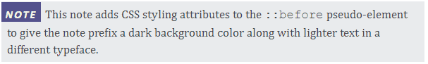
The preceding pseudo-element example doesn't provide much advantage over the autonumber example. But when you use CSS pseudo-elements, you have a wealth of styling options for creating more sophisticated note styles:
In the main element class defined below, the text-indent attribute moves the first line of the paragraph eight pixels to the left. This compensates for the eight pixels of padding added to the left side of the paragraph. The result is that the purple background of the note prefix aligns flush with the paragraph's left edge:
p.Note {
width: 600px;
text-indent: -8px;
padding: 6px 10px 6px 8px;
background-color: var(--GrayExtraLight);
}
The ::before pseudo-element specifies the background color of the prefix as well as the values for the font family, color, size, spacing, weight, style, and case. The margin and padding values align everything:
p.Note::before {
content: 'Note';
font-family: var(--FontSansSerif);
font-weight: bold;
font-style: italic;
font-size: 12pt;
line-height: 12pt;
text-transform: uppercase;
letter-spacing: 2px;
color: var(--YellowLight);
background-color: var(--PurpleDark);
padding: 8px 6px 1px 6px;
margin-right: 6px;
}
Tip: In the Flare GUI, the pseudo-element text can render slightly askew depending on which attributes you include. Generate the HTML output to see exactly how the note style renders in a browser.
Pseudo-Element as Pseudo-Heading
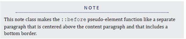
By default, the ::before pseudo-element works like a run-in heading (in CSS parlance, an inline-block element). But you can also make the pseudo-element appear to be a separate paragraph above the content paragraph. This is a great two-for-one deal. You assign a single CSS class to a single paragraph and you get a second paragraph for free:
Here, the main paragraph class does not use text-indent and it adjusts the padding as needed:
p.Note {
width: 600px;
padding: 6px 12px;
background-color: var(--GrayExtraLight);
}
The display attribute set to block makes the pseudo-element function like a separate paragraph. The following markup also sets the pseudo-element width a hundred pixels narrower than the paragraph element so that the dotted border is not as wide as the paragraph text:
p.Note::before {
content: 'Note';
display: block;
font-family: var(--FontSansSerif);
font-weight: bold;
font-size: 13pt;
color: var(--PurpleDark);
border-bottom: 2px dotted var(--PurpleDark);
width: 500px;
text-transform: uppercase;
letter-spacing: 3px;
text-align: center;
margin: 4px auto 10px auto;
padding-bottom: 4px;
}
Setting the left and right margins to auto centers the pseudo-paragraph. The text-align attribute then centers the prefix text within the pseudo-paragraph.
CSS "After" Pseudo-Element
The bookend to the ::before pseudo-element is the ::after pseudo-element that adds content after the actual paragraph text. Here, the ::after pseudo-element creates a bottom border within the note paragraph. Three paragraphs for the price of one!
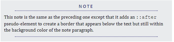
The ::after pseudo-element includes the content attribute with a blank space as its value so that the bottom border appears without any added text. The other attributes mimic those of the ::before pseudo-element:
p.Note::after {
content: ' ';
display: block;
border-bottom: 2px dotted var(--PurpleDark);
width: 500px;
margin: 4px auto 10px auto;
padding: 4px 20px;
}

Note Borders
Paragraph borders can also furnish ways to create distinctive note styles. Here are a few examples with their borders exaggerated to highlight the border styles.
Dashed Border
The most common border styles are solid, dotted, and dashed. Here's a thick dashed border.
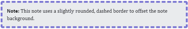
p.Note {
border-radius: 6px;
border: 6px dashed var(--PurpleMedium);
}
Highly Rounded Border
Use the border-radius attribute with a high value to round off boxy notes.
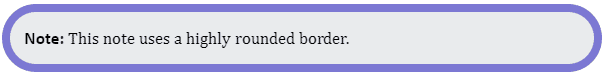
p.Note {
border-radius: 50px;
border: 8px solid var(--PurpleMedium);
}
Accent Border
Using a border on one side creates a simple accent.

p.Note {
border-radius: 0;
border-left: 8px solid var(--PurpleMedium);
}
Exotic Border Types
CSS provides several different border types that may suit your needs.
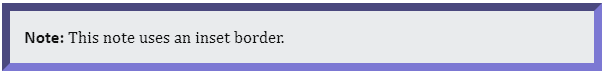
p.Note {
border-radius: 0;
border: 8px inset var(--PurpleMedium);
}
Note Background Images
It is easy to add an icon to a note using the CSS background attributes. If you include a background color with the note paragraph, use a PNG, GIF, or SVG image with a transparent background for the icon:

If the icon appears on the left side of the element, use enough left padding (40px here) to make space for the image:
p.Note {
width: 600px;
padding: 5px 10px 5px 40px;
background-image: url('../Images/note.png');
background-repeat: no-repeat;
background-position: 4px 10px;
min-height: 48px;
background-color: var(--GrayExtraLight);
}
Background Image and Repetition
Specify the relative URL to the background image file using the background-image attribute. Because background images tile across the element by default, specify background-repeat: no-repeat.
Background Positioning
CSS provides different values for positioning a background. The default is to place the image at the upper, left-hand corner of the element box. The background-position values shown above tweak the layout by moving the image 4 pixels to the right (horizontal offset) and 10 pixels down (vertical offset).
Minimum Height
The min-height value compensates for the fact that the note element height depends on the amount of text and does not take into account the background, so a single-line note can cut off the background image:
To rectify this, set min-height to at least the height of the background image plus the top and bottom padding values.
Summary
Border styles, background images, and the CSS ::before and ::after pseudo-elements are powerful tools for designing single-paragraph note styles. In the next article, I'll demonstrate how to create note styles that can encapsulate multiple elements such as numbered lists and tables.


