


Foundry is a UK-based company that offers a wide range of computer graphics and visual effects (VFX) software. Its suite of products, which includes Nuke, a compositing, editorial, and review application, and Modo, a 3D software package that combines modeling, texturing, and rendering, enable users to bring their creative visions to life. Foundry’s products have been used to create award-winning visual effect sequences in television and movies, such as Interstellar, Ex Machina, and Blade Runner 2049.
The documentation team at Foundry is responsible for supporting ten different software products and plugins, each with their own frequent release cycle. Dr. Ian Taylor, Head of Product Content at Foundry, leads the team in delivering user guides, release notes, and online Help sites to customers all over the world.
As Foundry’s products grew, and their documentation expanded from print-based to desktop and mobile audiences, Dr. Taylor looked for a way to provide users for a consistent experience across all their online Help sites, without creating a completely new site from scratch. By using the free responsive project templates available with MadCap Flare, Dr. Taylor and his team were able to modernize the look and feel of their online Help documentation in just under three months.
Identifying the challenges
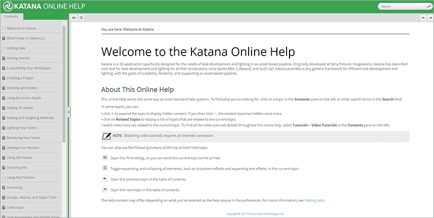
Online Help site for Katana, before redesign
When Dr. Taylor first started the redesign process, the goal was to create a cohesive brand experience across the range of documentation supporting Foundry software products. Their previous online Help used a tripane, side panel navigation, and lacked the shine and professionalism experienced with other sites. A key criteria was to enhance the user experience as well, integrating elements that would make it easier to navigate the documentation. “I was looking for design elements that would fit with our ambitions of a new, streamlined site,” explained Dr. Taylor. “We knew we wanted something that would be vastly different from the original design, with navigational features such as top navigation and dropdown menus.”
“We wanted our users to see our documentation and easily recognize it as Foundry,” added Dr. Taylor. “It needed to have all the modern standards of an up-to-date web help site.”
Seamless functionality was also a major criterion for Foundry. Its previous online Help was difficult to navigate, with topics displayed on one side of the screen. It needed a way to focus the user’s attention, with a stronger visual hierarchy. “The goal was to aim for a seamless user experience. Regardless of whether they’re looking at a user guide or an online Help site, they’re still in the same place,” said Dr. Taylor. “We want them to feel like they’re in a Foundry environment.”
Implementing the project templates
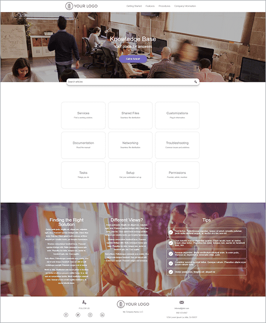
Balboa, a free Top Navigation template available for MadCap Flare users
When Dr. Taylor started the redesign process, he wasn’t looking to reinvent the wheel - instead, he looked for a solution that would allow his team to create what they needed. After looking through Flare’s free project templates, he selected the Balboa template, which included elements such as top navigation, a side menu, and responsive layout. “I chose the one that was closest in structure to what we needed, and would fit with our existing website,” said Dr. Taylor.
Instead of changing existing projects, Dr. Taylor found it easier to start an empty project with the Balboa template and import the topics and relevant files into the new template. “A good thing about the template is that it had its own master pages, so we didn’t have to author our own from scratch,” recalled Dr. Taylor. “We simply added additional HTML and code that fit into our final design.” While his background in programming played a role in adjusting the style of the template, Flare gave him the ability to easily change the skin, customizing elements such as the top navigation, drop down menus, and more, all out of the box.
Once the team were happy with the final look and feel, the next step was to apply the template to each product’s Flare project. “We created an empty project that included the template, and imported all topics, TOCs, and other files specific to each project into that template,” detailed Dr. Taylor.
Without the project templates, creating a brand-new online Help site would have been a challenge for the team, given their timeline. “We simply didn’t have the time to build a site from scratch,” explained Dr. Taylor. “The project templates were a great foundation – if we didn’t have them on hand, we may still be building the site.”
Lessons Learned
- Maintain a consistent set of standards. Dr. Taylor and the Foundry team maintained a common, standardized resource that served as a reference for styles, keeping the look and feel consistent across multiple projects. In addition, a style guide was created as an additional resource to ensure consistency.
- Keep it simple. As the team was responsible for multiple Help sites, each with their own unique content, it was vital to ensure consistency across all projects. “We try to maintain the navigational structure as much as possible, which we didn’t do before,” explained Dr. Taylor. “If you look at the new navigational bar system, you can view the same headings at the top of the screen, consistent across all sites.”
- Remember the importance of content and user experience. “When you’re experimenting with new features and technical improvements, it’s easy to forget who you’re designing it for,” said Dr. Taylor. “It’s important to keep the user in mind when creating a successful online Help site.”
Delivering a consistent experience across all products
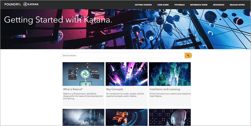
Online Help site for Katana, after redesign
After a few short months, the team launched the first version of the redesign, and never looked back. Their documentation is cohesive, responsive, and most importantly, provides the user with a streamlined experience across all Help sites.
The project templates provided the team with the head start they needed to revitalize their documentation. “Finally seeing the project templates available for Flare gave us a foundation for the redesign, and a faster route to achieving a new look and feel for our online Help sites,” Dr. Taylor observed.
It is all still new, but Dr. Taylor has noticed positive feedback since the launch. “There’s a stronger sense of integration between our documentation and the rest of the company and a feeling of increased potential with what can be achieved with our outputs,” Dr. Taylor explained. “We feel as though people take more notice of the improvements, and as a result, there’s a sense of pride with the way the documentation looks now.”
Want to view more examples of documentation sites, created with MadCap Flare? Take a look at our Customer Showcase and view the featured sites.


