


Take a moment to review your team’s published documentation. Squint your eyes at it. The most important information on the screen should be obvious. Hierarchy, or the information’s order of importance, should be obvious. Rich layers of content need to be discoverable with a brief observation.
MadCap Flare provides every author with the ability to accomplish these objectives out of the box. The following information will introduce design best practices in the form of a guided exercise.
Analyze your Content
Good news everyone! Rules of hierarchy apply to all mediums. The end goal is the same; to present information to the user without requiring them to think. (Steve Krug)
Try this exercise and invite your team to participate by asking these questions:
- Is your content organized, inspired and designed with purpose?
- Can you instantly identify the hierarchy of the information?
- Does the content invite the user to scan, explore, click and hunt?
- Can you identify any visual elements that distract from the effectiveness of the information?
Reduce the Cognitive Load
Avoid distracting from your message with poor design. It is easy to say that your content is fine. Fine might be an acceptable baseline, but ask and observe your end users. They are why we are here, to delight their eyes with clarity and repetition of how information is presented.
UX designers consider the user’s available brain space, or the “cognitive load” when making design decisions. Users groan when a wall of text is presented to them. They tend to over-click, quickly passing through content seeking their answer when they get annoyed by poor hierarchy. They are distracted by a heavy cognitive load.
A consistent hierarchy, repetition of styles/functionality and a great font will deliver pleasantly scannable content. Further increase scannability by increasing the space between letterforms (kerning) and line height (leading). The end user will appreciate the end result!
Remember, your content is not what YOU say it is, it is what your USERS say it is. Meaning, if you think the information architecture of your content is “Fine” then your users might think otherwise. A user can immediately disengage from the overall purpose of finding answers by seeing the dreaded wall of text staring back at them.
Distraction and annoyance renders content impotent. It is paramount to not get in the way of your message! If your team is feeling adventurous, the following examples are ways to encourage the user to WANT to look at the blob of fuzzy text.
Font Matters
The fact is, a poor typeface increases the cognitive load placed upon the user. Increasing the letter-spacing and line-height CSS properties tends to result in lighter, easier to read content.
Every font is designed differently. For the Flare user, experimenting and testing these properties are necessary. Choosing a well-designed font will reduce visual clutter and decrease the cognitive load placed upon each user.
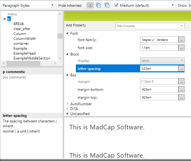
Use the ‘em’ property to define all fonts, paragraphs, notes and headings. Utilizing ‘em’ instead of pixels (px) allows for precise control of your content’s visual appeal.
For this exercise, implement the following recommended best font practices into your CSS:
- Create a copy of your stylesheet for testing
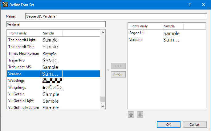
- Set the font family to ‘Segoe UI, Verdana’ <ul>
- Create a Font Family using Segoe UI and Verdana: </ul>
- Set the font size to ‘1.1em’
- Adjust the ‘letter spacing’ to ‘0.02em’
- Set the line height to ‘1.7em’
- Set font color to ‘1e1e1e’
SEGOE UI is applied to all heading, body copy, navigational elements and notes, seen below:
If Segoe UI is not installed, allow VERDANA to be applied to all headings, body copy, navigational elements and notes:
Segoe UI is widely used by Microsoft and should be familiar to most users. This font is my default for all Flare outputs, as the generous letter spacing allows for large blocks of text to not appear heavy. Alternatively, decreasing letter spacing to make small blocks of text appear clean and compact. Versatile fonts simplify the design process and provide the visual foundation for content.
Structured for Scannability
Most users don’t want to hunt for answers, they want answers to be obvious. Clearly display the path for their eyes to follow. Provide large headings (1.8em) and uniquely colored dropdowns to decrease frustration and relieve eye strain.
Additionally, break up your content into scannable text. Two or three sentences presents nicely.
Scannability Best Practices
- A consistent column width works brilliantly with top nav solution.
- Style Dropdowns to reflect your existing heading levels:
- Title (2.0em)
- H1 (1.8em)
- H2 (1.6em, nested inside h1)
- H3 (1.4em, nested inside h2)
- H4 (1.2em, nested inside h3)
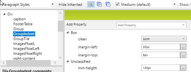
- Strategically organize content in a clean format. This can be achieved by adding a special Div I have named GroupIndent:
- Create a new Div.
- Name it GroupIndent.
- Select multiple blocks of content (P tags, Complex Selectors etc.)
- Hit TAB.
- Apply your GroupIndent Div.
Color
Deliver documentation that is visually consistent with your company’s products. Modify the Flare output to mirror your company’s software, product, or service. Many companies have set guidelines regarding color schemes and styles. If a company style guide exists, apply those rules to the CSS.
- Ask your supervisor or marketing/design department (or the person who knows Photoshop) for the company/product style guide.
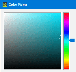
- If there’s no style guide in place, feel free to utilize the amazing, time saving color picker feature Flare provides to pull the appropriate company colors.
- Apply your company’s primary and secondary color to the top nav and side menus.
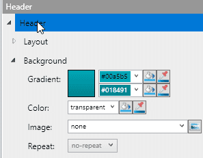
- Consider this trick for upgrading the visual appeal of your nav bar:
- Open your HTML5 – Top Navigation skin:
- Click Header.
- Click Background.
- Assign two separate but very similar colors for the gradient.
- Use the color picker to create a gradient within Flare to assign your company’s color:
- Open your HTML5 – Top Navigation skin:
Conclusion
Applying font, structural and color properties to your CSS will enhance the visual appeal of your content. However design is a double edged sword. Poor design can cause increased eye strain which can, for some, bring on a headache.
Experiment to engage the user. Elevate your design. Delight their eyes!


