


This guest post was written by Laura Charles Johnson, the documentation team manager for MicroStrategy. In her role, Ms. Johnson’s favorite responsibility is to turn junior writers into power Flare users. She’s done that with 9 writers so far. Ms. Johnson has used Flare since version 1 and is a certified Advanced Flare Developer and trainer.
Using tabs in your Flare topics is a great way to layer information on a page, and progressively show content to the reader. The user requests content to be displayed by clicking (or perhaps hovering over) the content’s corresponding tab.
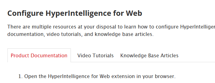
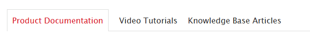
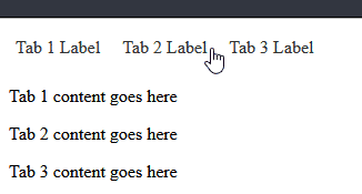
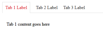
First, let’s look at how tabs look in production. Here’s the default state.
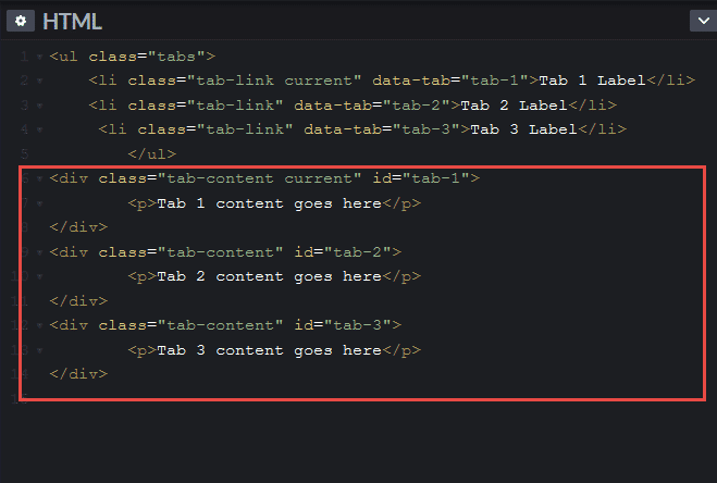
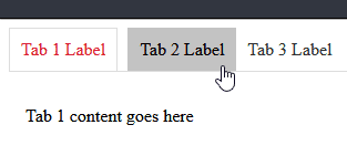
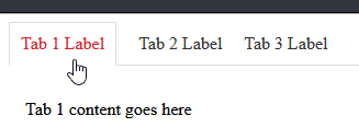
And here’s another tab in its hover state.

To try it yourself, go here.
To make these tabs work, there are three pieces involved and I will explain each one.
- HTML
- CSS
- Javascript
HTML
For those of you familiar with Codepen, here’s a pen with all the code you need: https://codepen.io/LCJohnson/pen/XWWeLNR
If you’re not familiar with CodePen, let’s talk. It’s a pretty awesome tool for writing and testing code before you put it in MadCap Flare. When you open the Codepen link, you’ll see the following:
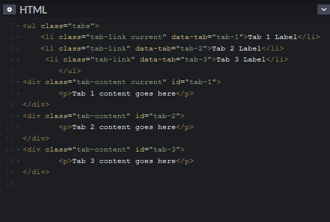
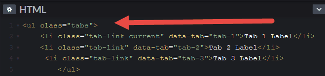
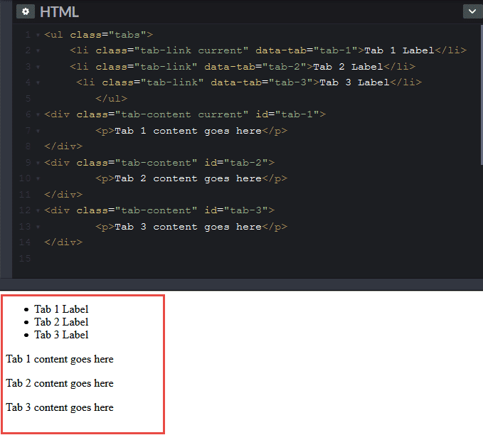
The first section of the code is the <ul> that allows you to create the tab labels.
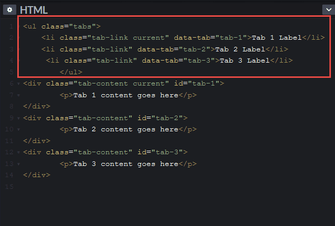
These labels should include text that you would like to have displayed as the title of each tab (i.e., “Product Documentation”, “Video Tutorials” and “Knowledge Base Articles”).
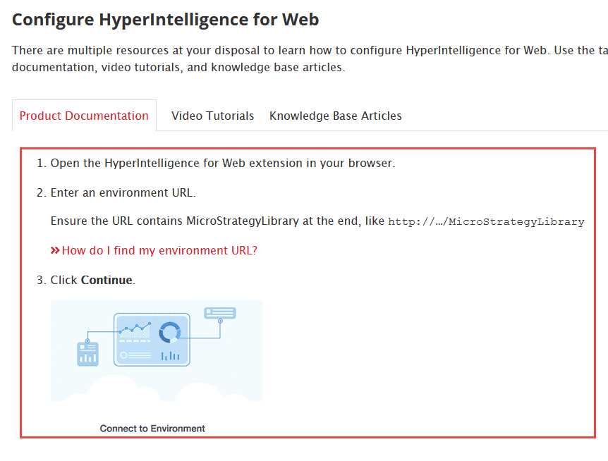
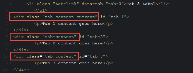
The second section is where you will place content to appear when you click on a different tab.
Each div tag contains the content of a tab.
The content inside the <div> tags are what you want to put inside each tab. For example, when a user clicks on the “Product Documentation” tab, the following content within the red box will appear.
Ok, let’s talk about the parts of the code.
The Unordered List
First, we want to give the <ul> tag a style class because its behavior will be different from all other <ul> tags in the project. This <ul> will have a class named ‘tabs.’
Next, we want to make sure that each <li> tag, or tab label, has its own ‘data-tab’ designation. You need this for the JavaScript. I went the easy route and just named each one ‘tab-1,’ ‘tab-2,’ etc. Keep in mind that you want this to be generic so you can use this tab code wherever you want throughout your projects.
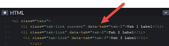
Next, you’ll see that each <li> shares a class, ‘tab-link,’ but the first <li> has a 2nd class, ‘current.’ It’s a tag with multiple classes. If you’ve not come across tags with multiple classes, that’s ok. It happens all the time and browsers are fine with it.
The ‘current’ is important because it tells the browser which tab and which tab content to open first.
The <Div> Tags
After you have your <ul> created, we can move on to the <div> tag. Each <div> has the ‘tab-content’ class applied because we want to make sure that the behavior is separate from any other <div> tags.
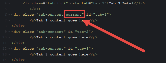
Don’t forget that one of the <div> tags needs to have the ‘current’ class assigned so the browser knows to show that content when the page loads.
Next, you’ll notice that each <div> tag has its own ID and that it is identical to the data-tabs in the <li> tags that we looked at a few minutes ago. This is key because it tells the browser which <div> is associated with which tab. So, whatever you name them, make sure they match between the <li> tags and the <div> tags.
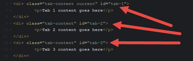
Last is the tab content. In this example, the contents of the tab are surrounded by a <p> tag. But you could put anything here like I did in the second tab.
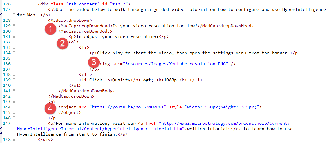
I’ve added the following:
- A Flare dropdown
- An ordered list
- An image
- A video
So, consider the tab content a container where you can put absolutely anything you’d put in a topic – although you should avoid H1s because there should only be one of those per topic/web page.
Let’s look at our tabs right now in CodePen. That’s the cool thing about CodePen, it renders your code instantly, so you can perfect it before adding it to Flare and having to build your project every time. (Super time saver!!).
Yeah, that’s boring and certainly does not look like tabs! But, we have the code (AKA the skeleton) in place. Now we have to add some muscle (JavaScript) and skin (CSS).
JavaScript
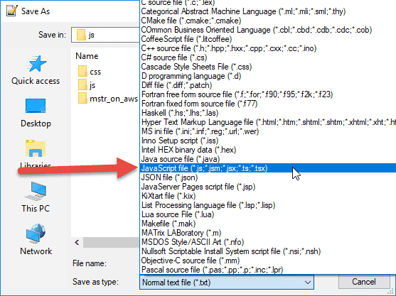
Here’s the JavaScript file that we have in our js folder located in our Resources folder. You may not have a js folder since it’s not a default folder in a Flare project. You should create one now.
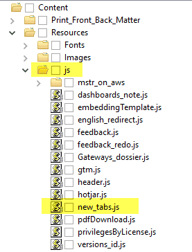
To create a .js file, open your favorite code editing tool (Notepad++ is a great choice). Copy the code in the .js section of the Codepen I provided and paste it in a new file in Notepad++. Save it as a .js file to the Resources > js folder that you’ve created and it will be ready for use.
Don’t be intimidated if you’re not familiar with JavaScript. When I open the file, this is all there is. I’ll explain what it does next.
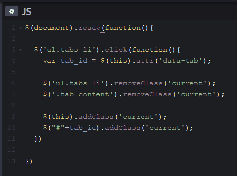
Long story short, this code tells the browser to remove the ‘current’ class from the default tab and add it to whichever tab is clicked next. When the user clicks on a tab other than the one open, this JavaScript tells the browser to close the open tab content and open the clicked-on one…and to move the ‘current’ look and feel from the previous tab to the clicked-on one.
What do you actually need to know to make the tabs work?
Simple: just add this line of code in the <head> of your masterpage:
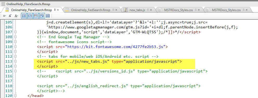
We have a lot of custom code in the head of our masterpage, so you likely won’t be adding this to line 113. Don’t panic if you’re on line 4!
You’re good to go! It will just sit there not bothering anything until you add tabs somewhere. You are done with the JavaScript part of this. YEAH!
We’ve now added the muscle…now let’s add the skin, AKA the CSS.
CSS
I don’t want to freak you out…but the CSS for this is a bit long. I have it at around 80 lines long including nice spacing and comments at the beginning and end.
(Again, the code is available in my CodePen to just copy and paste into your stylesheet.)
Let’s start at the beginning. I’m not going to discuss every line – just the ones that aren’t your every day CSS and are important to the look and feel of the tabs.
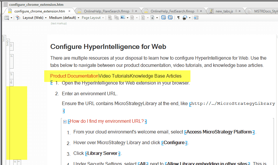
Important note: as you build this in Flare, you’ll likely be checking out the topic via the XML Editor. It will not look right and it definitely won’t work (that’s why I really recommend using Codepen first). Do not panic. This is to be expected. If your page looks kind of like this, you’re golden.
OK, let's have some CSS fun.
*Tip: When you’re ready to add this to Flare, I recommend opening your stylesheet in the internal text editor or in your favorite code editor. This isn’t a requirement, but it does make adding blocks of CSS much easier and faster. To open the internal text editor in Flare, right-click on your stylesheet and select Open with > Internal Text Editor. Copy and paste the CSS from Codepen into your stylesheet.
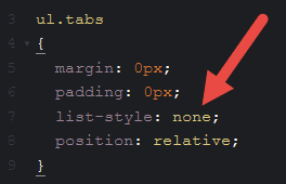
First, we need to remove the bullets from the list. List-style:none makes that happen.
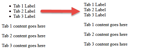
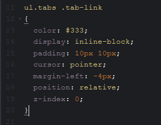
Now we want to make the list shift from vertical to horizontal, make a pointer appear when someone hovers over a tab, change the color, and add some padding between each list item. To do this, I added the following:
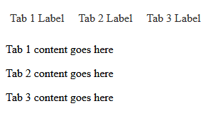
Now our tabs are looking a little more like tabs.
And you’ll see a pointer appear when you hover over a tab.
Next, we want the ‘current’ tab to have its own look. To my ‘current’ class, I added the following:
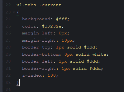
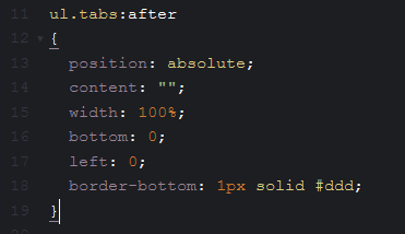
Now I want a faint gray line to appear under the non-current tabs. So I’ll create an :after selector with the color.
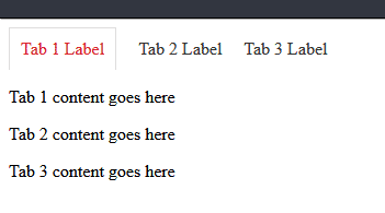
Here’s the line. Notice how it only appears under the closed tabs. It makes the current tab look open.
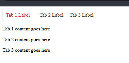
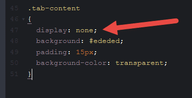
That’s great – but I still see all the content from all tabs. I only want to see tab 1 content. Let’s do that next. The trick here is the display:none. It makes everything with the class of .tab-content disappear.
I’ve taken it a little too far because now even the tab 1 content is missing. But Progress! Let’s put tab 1 content back in. That’s where that ‘current’ class comes in.
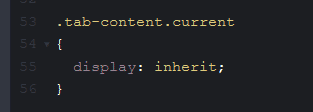
I use display:inherit to make sure that the ‘current’ tab content appears. ‘Inherit’ here essentially discards the display:none of the .tab-content class and, instead, “inherits” the display:block from a parent tag, in this case a <div> tag. Does it sound weird, yes? Does it work, absolutely!
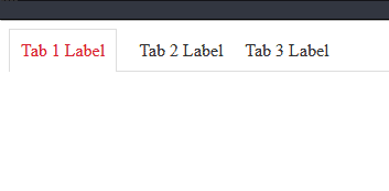
And it’s back!
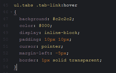
Now I’ll add some styles for the hover state of the non-current tabs. In this instance, I want the tab to turn gray and the text to be black so there’s still good contrast between text and background. So I’ll create a :hover pseudo-class.
It’s happening!
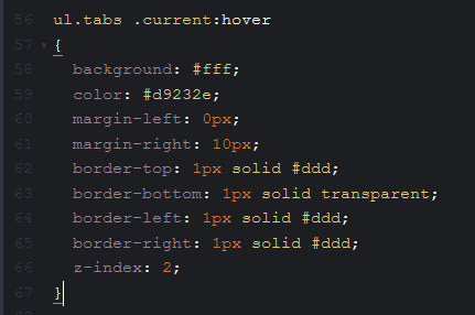
Now I want to make sure that the ‘current’ tab doesn’t change when someone hovers over it. So I set the .current:hover state to the same settings as .current. That way, nothing changes.
It looks so good!
As you click across, the content should change.
You know what this means? You. Have. Made. Tabs. If this is your first foray into JavaScript, you did great!
Have questions? Post them below.


