


The second article in a five-part series, Paul Stoecklein has headed up the documentation department at MadCap Software since its inception, overseeing the development and publication of all online Help systems, PDF manuals, and video tutorials for all applications in the MadCap product family.
One of my pet peeves (aside from the phrase “pet peeve”) is when you open an online Help topic and you have to scroll through a whoooooooole bunch of text to find what you need.
Don’t get me wrong. I have some long topics. Sometimes there’s no way to get around that. I’d rather have too much information in a topic than not enough. I’d also rather look in one long topic for related information than in 25 separate, but smaller, topics. But with only flat text in a long topic, it can be overwhelming and really difficult to locate stuff.
That’s why I’m a huge fan of drop-downs, which let you condense a particularly long topic into multiple sections. Rather than seeing a massive sea of text, users are faced with a little bit of text and a handful of links that open the rest of the content. It’s much less intimidating, and much easier to navigate.
Keep in mind that some people prefer togglers over drop-downs. That’s cool. Just use what works best for you. I simply prefer drop-downs.
Using Drop-Downs in Your Documentation
As the following image shows, when you first open topic in the output, you’re looking at it from a bird’s-eye view.
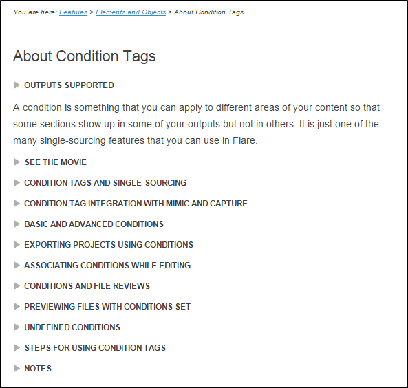
If you want to read from beginning to end, that’s fine. But if you want to quickly locate something in the middle, or toward the bottom of the topic, this is a much easier way to do it.
Not only that, but I often have nested drop-downs (i.e., drop-downs within drop-downs), depending on how much information each drop-down contains. Sometimes it goes to four levels deep.
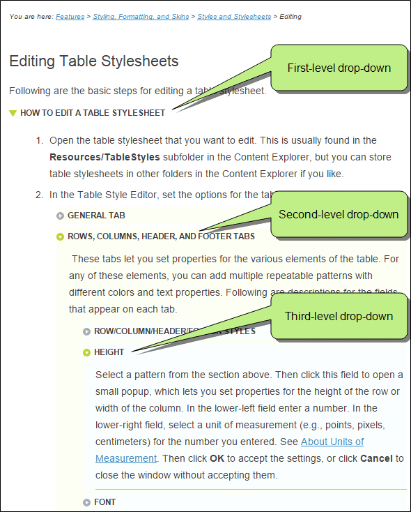
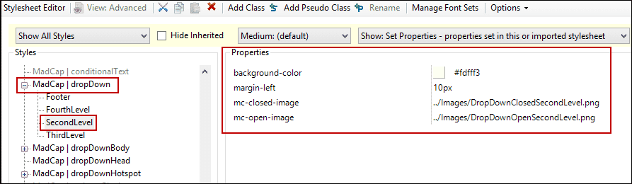
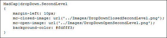
In order to make nested drop-downs easier to read and distinguish from other drop-downs, I use classes on the MadCap|dropDown style. With my style classes, I give the deeper (2nd, 3rd, and 4th) levels a light background color, and I indent each level.
Stylesheet Editor:
Internal Text Editor:
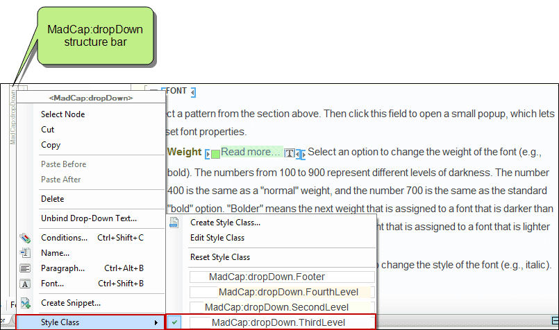
I don’t apply a style to my first-level drop-downs, but when I create a drop-down at the second, third, or fourth level, I right-click on the MadCap:dropDown structure bar, and I select the appropriate style class.
And by the way, drop-downs also help me with the issue of advanced users versus beginners. I’d love to produce entirely separate documentation sets for users with different levels of experience, but I simply don’t have time. So I rely on drop-downs to help me.
For example, I might have a step in a procedure, and maybe the text in that step is all that experienced users need. But then I’ll add an example after that text for the benefit of newer users. By putting the example within a drop-down, users can decide for themselves if they want to open it. Experienced users can skip it and get on with their lives. Newer users can open it to get the extra help they need.
Any experienced technical writer knows that the volume of documentation you create can easily get away from you. That’s why drop-downs can be such a great tool. They help to keep your online topics organized and easier to read, and they help prevent your readers from throwing their hands in the air and saying, “Oh I give up! I think I’ll just call tech support.”