


This guest post was written by Scott DeLoach, a certified Flare consultant and trainer. Scott provides consulting, training, migration, and custom CSS/jQuery development services to companies that use MadCap Flare. He is the author of MadCap Flare: The Definitive Guide, HTML5 to the Point, and CSS to the Point and the manager of MadCap’s MAD for Flare certification program. You can email Scott at scott@clickstart.net.
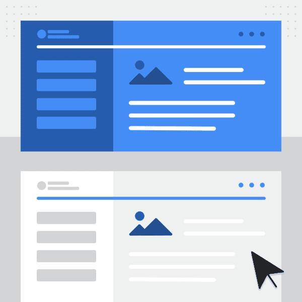
What is Dark Mode?
Dark mode is a design theme that uses light text on a dark background. The basic goal of dark mode is to reduce the amount of light emitted from the screen while still meeting the minimum color contrast ratios required for readability. In this blog post, I will explain how to include a light/dark mode theme switcher in HTML5 targets.
Why Should I Add Support for Dark Mode?
It's easy to dismiss dark mode as a design fad. However, there are several reasons you should consider providing a dark mode option:
- Some users like dark mode and find it easier to read content in dark mode
- It might match your company's design guidelines/requirements
- It's less likely to trigger sensitivity to light (photophobia)
- It is easier to read content in dark mode in low-light environments
Examples
Like websites, most HTML5 targets use a default light theme. However, some sites use a dark theme to match the site's design goals (the "prince of darkness" uses a dark theme at https://www.ozzy.com). Other sites use a dark theme based on their users' environment and/or goals. For example, https://www.nbc.com uses a dark theme because users are either watching TV in a dark room while visiting the site or watching videos on the site.
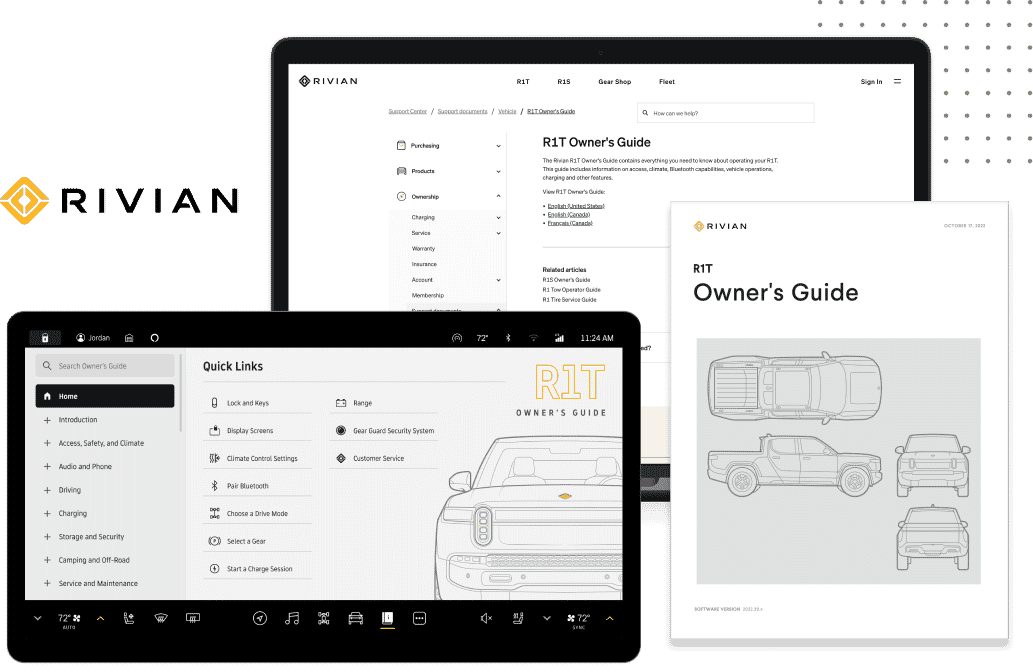
You should consider your own company's design guidelines and users’ environment(s) to select your default color theme. If your users sometimes work in a low-light environment and/or prefer dark mode (e.g., software developers), you should provide a theme mode switcher. For example, Rivian's in-dash vehicle guide (https://www.madcapsoftware.com/case-study/rivian-uses-madcap-software/) allows users to select a dark or light mode. It also automatically switches to light mode at sunrise and dark mode at sunset.
Design Considerations
Designing a dark mode theme is more complex than simply setting the background color to black and the text color to white. Most dark mode designs use a dark grey background color and a very light grey text color. For example, Google's Material Design recommends #121212 for a dark mode theme background color. You should also consider adjusting the following settings in your stylesheet:
- border colors
- link colors
- font weight (a thinner font is often easier to read on a dark background)
- letter spacing and line height (lighter text often needs more space between letters and lines)
- drop shadows
- image opacity
You should verify that your light and dark mode designs meet accessibility contrast ratio requirements. There are several free sites that can be used to test a design's contrast ratios. My favorite is https://color.a11y.com.
Creating a Theme Switcher
A theme switcher should allow the user to select light or dark mode, remember the selection, and automatically apply it when a new topic is opened.
CSS
In the sample styles rules below, the light and dark mode colors are set using CSS custom properties (also known as CSS variables). CSS custom properties make it easier to swap the colors.
body.light
{
  --text: dark;
  --background: white;
}

body.dark
{
  --text: white;
  --background: black;
}

body
{
  color: var(--text);
  background: var(--background);
}
HTML
The switcher itself is a button that toggles between light and dark. I add the button to my template page so that it’s available in every topic.
<button id="theme-toggle">Change theme</button>jQuery
When a topic opens, the theme switcher uses jQuery to check for a previously selected and saved color theme. If a theme has been saved, it’s immediately applied by setting a class for the body tag.
<script>
  const theme = localStorage.getItem('colorTheme') || 'light';
  document.body.className = theme;
</script>
When the user clicks the “Change theme” button, the script changes the body tag’s class to swap the theme and saves the selected theme in local storage.
function swapTheme(theme) {
  document.body.className = theme;
}

setTimeout(() => {
  let theme = localStorage.getItem('colorTheme') || 'light';
  swapTheme(theme);
$('#theme-toggle').click(function() {
    if (theme === 'light') { newTheme = 'dark'; }
    else { newTheme = 'light'; }
    swapTheme(newTheme);
    localStorage.setItem('colorTheme', newTheme);
    theme = newTheme;
  });
}, 0);
I place the jQuery code in a script file and link to it from the template page, but you can include the script in the template page if you prefer that approach.
Advanced Customizations
The code samples provided above and the sample project mentioned below intentionally use simple formatting to make them easier to reuse. You could (and probably should) add more “light” and “dark” theme formatting. You could also incorporate the button into a toolbar with other buttons.
The mode switcher only changes the formatting in topics, which is setup using styles. It does not change the formatting in the banner or menu areas, which is setup using a skin. I usually use the same banner and menu design for light and dark themes. However, Flare has a built-in feature called “runtime skins” that can be used to switch between a light and dark skin design. For more information about runtime skins, see https://help.madcapsoftware.com/flare2022r2/Content/Flare/Skins/Other-Activities/HTML5/Enabling-Runtime-Skins.htm.
Sample Project
Right-click and select save as to download the sample Flare project: https://bit.ly/theme-switcher
