


Laura Johnson, a certified MadCap Advanced Developer, is the creator of Flare for Help, a tips and tricks blog focused on MadCap Flare technical documentation and consultancy. She helps companies create and deliver industry-best documentation and content. Here, Laura shares a great use of CSS Selectors to control container <div> sizes.
I’m building a help system that is supposed to look like slides. It’s for a classroom training effort and instead of PowerPoint (boo!), my client wants to use Flare (yeah!!).
Part of the design involves two div tags next to each other:
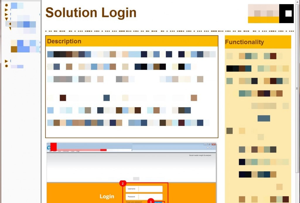
Notice how the Description and Functionality boxes are side by side. Generally, this can be handled via two <div> tags floated left. No big deal, right?
Here’s the code for both <div> tags:
First, the larger <div> on the left:
div.description
{
 background-image: none;
 background-repeat: no-repeat;
 background-color: #ffffff;
 border: solid 2px #733d02;
 margin-left: 0px;
 margin-top: 0px;
 margin-bottom: 15px;
 width: 70%;
}
And here is the code for the smaller <div> on the right
div.tips
{
    float: right;
    border: solid 0px #696969;
    padding: 0px;
    width: 27%;
    margin-left: 10px;
    margin-top: 0px;
    margin-right: 0px;
}
But sometimes the Functionality box (div.tips) isn’t there. Like this:
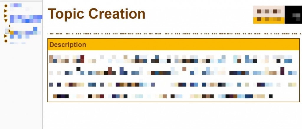
This situation occurs more than a little frequently. And it’s on pages like this where I want the width of the div.description tag to be 100%. Like this:
div.description
{
    background-image: none;
    background-repeat: no-repeat;
    background-color: #ffffff;
    border: solid 2px #733d02;
    margin-left: 0px;
    margin-top: 0px;
    margin-bottom: 15px;
    width: 100%;
}
If I’m being honest here, the lack of the Functionality area on the right is going to happen more often than I’d like to contemplate AND there will be thousands and thousands of pages over a large number of projects. UGH.
And I may have mentioned this a couple of times on this blog – I am NOT a fan of working inefficiently. I prefer to work smarter, not harder. This situation could be problematic…how can I fix this without having to look at each page and determine whether or not the right-most <div> tag will be there and then set the width of the left-most <div> tag accordingly.
Uh….that is sooooo not happening. I’m fixing this mess with some handy-dandy CSS code.
When both <div> tags are there, div.description will be set to width:70% and the div.tips will be set to width:27%.

That’s great….but how do I tell CSS to determine IF the div.tips box is there and THEN to change the width of div.description? Sounds all code-y and scary.
Luckily for me, the nice folks over at W3C already thought about this and, by using an advanced CSS selector, it can be done with 2 lines of code in my style sheet.
<happy dance>

</happy dance>
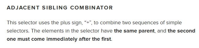
In all fairness, I had to look up the actual name of the selector: Adjacent Sibling Combinator.
Ew….sounds ugly and unpleasant to work with.
However, this amazing Smashing Magazine article about Advanced CSS Selectors defines an Adjacent Sibling Combinator as:
The solution to our problem is a great example of this:
div.tips + div.description
{
    width: 70%;
}
What I’m telling the style sheet to do is this:
When the two <div> tags appear together, the width of div.description will change to 70%.
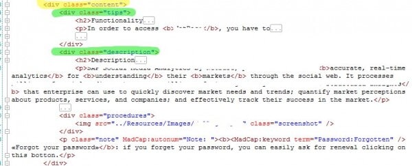
In this screenshot, the yellow highlighted <div> tag is the parent container. The green highlighted <div> tags are the siblings. And technically, they are adjacent.
This made me so happy, I could cry. No longer did I have to worry about which topics had both <div> tags and which doesn’t! It just works. Woohoooo!
Try it…and let me know if you have any questions.