


Thig guest post was written by Joe Cheverie, a technical writer at MadCap Software, with extensive experience writing installation guides, online Help systems, and user guides for software products. In the first part of this two-part series, he describes his experiences and the challenges of creating one output from a single project combined from multiple Flare projects.
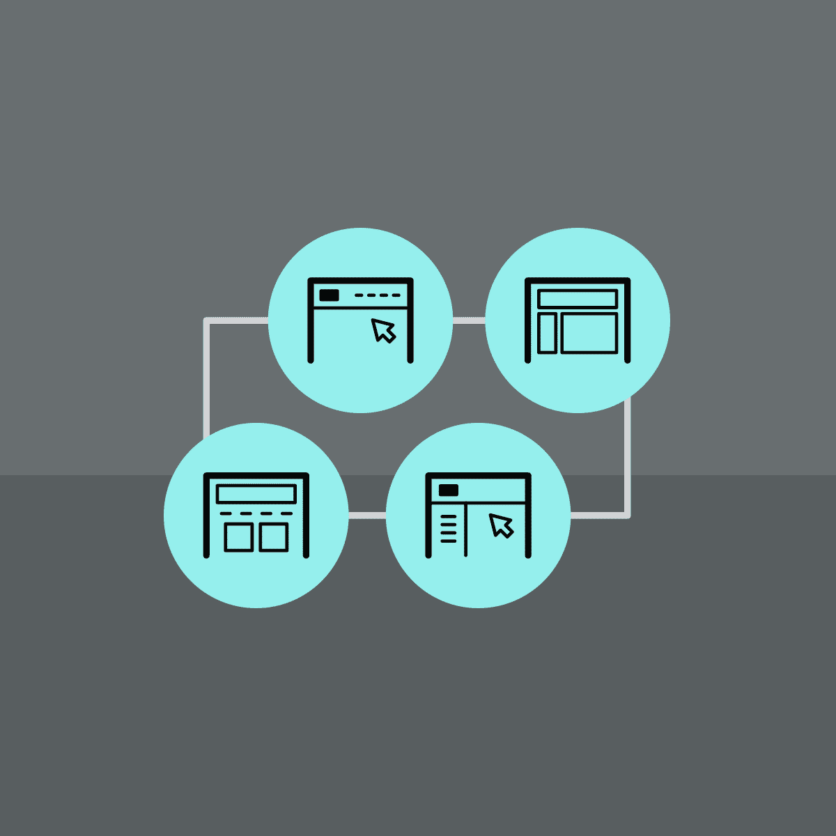
When building your target, one of the choices you have to make is what navigation design is best suited for your output. Is it the classic Tripane look? Or perhaps a Top Navigation output is better for your product? Maybe you want to leverage MadCap Flare’s new Side Navigation format? Or perhaps you want a stripped-down look with a skinless navigation?
This blog post will take a close look at the different navigation designs available in Flare, reviewing the templates, skins, and other options available with each. We will also provide the pros and cons, along with examples of each navigation design.
Side Navigation
Using a flexible and frameless output, Side Navigation displays the main navigation from either the left or right side. Since the menu is set vertically in side navigation, this allows for more room for first-level TOC items.
Flare provides you with a Side Navigation template when you create a new project. You can also modify an existing project by editing the skin in your target to use Side Navigation.
Using Side Navigation
Be sure to synchronize your navigation elements with your TOC entries. This will help avoid duplicate TOC entries. To learn more, view the online Help topic on TOC entries.
Since responsive content is automatically enabled for Side Navigation, you can set a few additional options in the skins. You can set the breakpoints (maximum width) for tablet and mobile views. There is also an option to enable devices with media queries to set the width based on the size of the device.
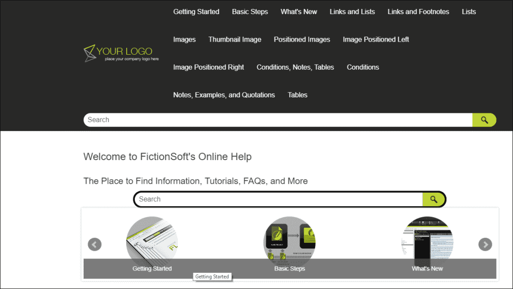
Here is an example of side navigation output, where the main menu is set on the right side.
Pros:
- More room for first-level TOC items
- Options to configure flyout menus to display on either the left or right side
Cons:
- Cannot merge with other projects
Top Navigation
With the main navigation positioned at the top of the screen, this type of navigation can provide a modern look and feel to your output. Top Navigation is also frameless and provides many flexible options for your output.
Top Navigation outputs are also responsive when viewed on a tablet or mobile device. On smaller devices, the top navigation is replaced with a flyout menu that displays on the side instead.
There are several templates you can use for creating your Top Navigation output. When creating your Flare project, the templates can be found under both the Online folder and the Online & Print folder.
Using Top Navigation
It is recommended that you set only a few top-level books or entries in your TOC for Top Navigation. Otherwise, the top-level menu items in your TOC will break over multiple lines.
Here’s an example of how too many top-level TOC items would display in your output. This is the TOC being used for Top Navigation:
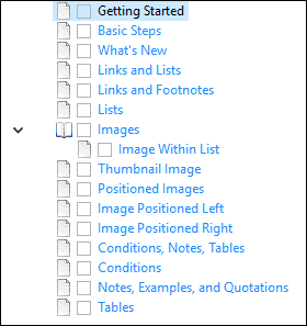
This is how that TOC will render in your Top Navigation output:
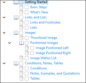
But if you restructure your TOC to have fewer top-level items like this:
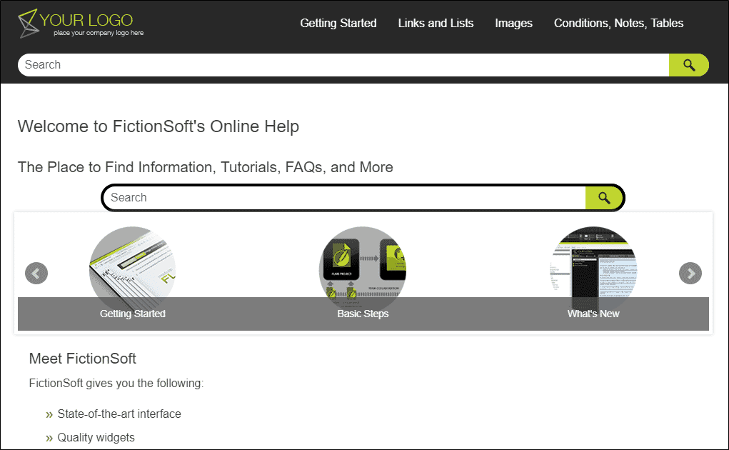
Then your Top Navigation output will look cleaner:
Pros:
- Mobile device layout options to turn off Top Nav and replace with flyout menu
Cons:
- Need to limit number of TOC books/entries
- Cannot merge with other projects
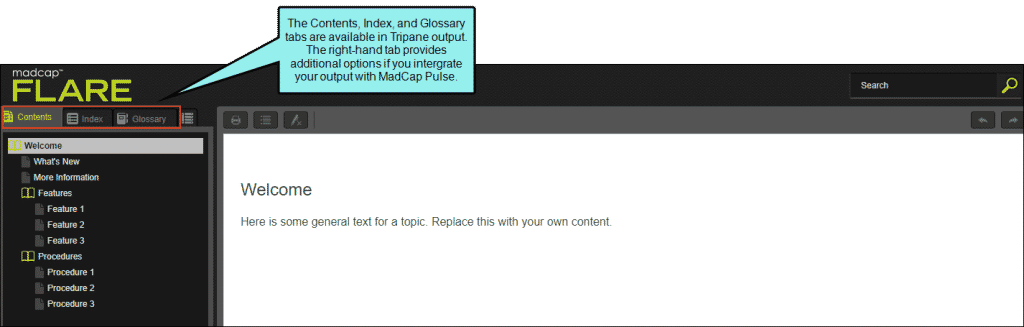
Tripane Navigation
If you are looking for a traditional look for your output, the Tripane navigation is a good option. This output provides three distinct frames: a top frame for your logo and search bar, a left navigation frame, and your main content frame on the right.
One of the advantages of using Tripane is that it supports project merging. None of the other HTML5 navigation designs support project merging.
Using Tripane Navigation
One thing to note about setting responsive options in Tripane outputs is that if changes have been made in both the skin and target editor, the target takes precedence. You can use either the Tripane or Tripane Light skin for your output.
Here is an example of how your Tripane output may look:
You can configure your search preferences in the Skin Editor.
Pros:
- Supports project merging
- Navigation tabs for Contents, Index, Glossary, Browse Sequences, and Pulse community
Cons:
- Resizing the browser on your desktop or laptop hides your search bar, moving it into the flyout
- Responsive skin is not always enabled
- No skin component for search bar or search results
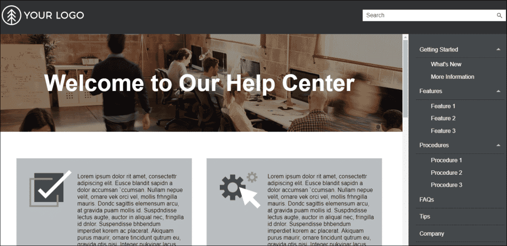
Skinless Navigation
Why use a skinless navigation? Perhaps you want the cleanest output possible to present your content without the distraction of navigation bars. In that case, it would be beneficial to publish your content with no skin file on your target.
If you are looking for an output that matches existing products (e.g., marketing website, support website) at your company, skinless navigation does offer a lot of flexibility. It requires some design and planning up front to ensure your users can access all of your content provided in your output.
Using Skinless Navigation
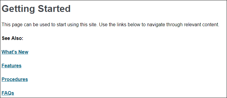
In the Target Editor for your output, on the Skin tab just set your Skin to (none). While that is all that you have to do to omit a skin, you also need to provide your users a way to navigate to the content. Otherwise, your content may end up looking like this:
While you have accomplished your initial goal of having no skins in your output, you cannot access any of your other content beyond the landing page.
But if you insert links or a proxy on your landing page, you can ensure your users can access other content in your output. Here is an example of using links on your landing page:
If you use Zendesk Help Center, you can use your skinless output to publish your content directly to Zendesk. For more information, view the online Help topic on Zendesk Publishing.
To view an example, SMART Technologies uses a skinless output on its Help site to match the look and feel of its other products. Read more about their case study here.
Pros:
- Clean frame for reading the main content pane
- Lots of customizable options with menu proxies
- Zendesk plug-in integration
Cons:
- No main navigation
- Cannot merge with other projects
Conclusion
The good news is that any of the four HTML5 navigation types that we covered provide plenty of options to give you the type of output you want for your users. So which navigation should you use? Maybe this summary can assist your decision-making:
- Side Navigation provides lots of flexibility, since you can set the main navigation either on the left or right. There is also a lot more room for first-level TOC items.
- Top Navigation allows you the option to replace the navigation pane with a flyout menu if you are using a mobile device layout. Just remember that you have to limit the number of top-level TOC entries.
- Tripane Navigation is the only design you can use to merge projects. But remember that resizing the browser will move your search bar to the flyout.
- Skinless Navigation allows you a clean reading space if you want to keep a lot of room for content, and not crowd it with navigation elements. You can also use skinless navigation for Zendesk plug-in integration.
Which navigation design are you using for your outputs? Let us know in the comments and questions below!

