


In this post, Neil Perlin gives an overview of the link types available in MadCap Flare, including how to customize through CSS and best utilize the links. This article was originally published in the Hyper/Word Services blog, and reprinted with permission.
Flare offers a wide variety of link types. Some, like hyperlinks, and popups, are common and easy to understand. Others, like cross-references, dropdowns, expanding links, and togglers, may be unfamiliar. In this post, I’ll look at all of these link types, discuss how to create them, how to customize them through the CSS, their uses, and some of their design implications.
Hyperlinks
Hyperlinks are the standard “jump” link. Clicking on a hyperlink takes users from the starting topic to the target topic. A target topic usually replaces the starting topic in the browser window but you can make the target topic open in a second browser window, resulting in two windows open on the screen (and perhaps many windows if users leave each “secondary” window open after looking at its topic).
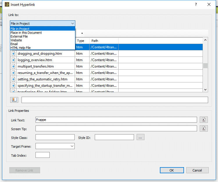
Hyperlinks are very flexible; you can create all the types shown in the Insert Hyperlink dialog box’s Link To dropdown, below.
Customization Through the CSS
Unvisited hyperlinks typically display in a dark blue, underlined font. You can change these properties by editing the “a” style in the Stylesheet Editor. (What does the “a” style have to do with a hyperlink? The story (which I haven’t verified) is that when Tim Berners-Lee created HTML, he decided that a link was a connection between associated pieces of content. Ergo, “a” for associated.)
Hyperlink Drawbacks
A hyperlink “knows” that it points to the URL of its target topic but doesn’t know what that topic is or what to do if the title of the target topic changes. This can cause surprising problems.
Let’s say you hyperlink the word “Frappe” in topic A and point it to a target topic called Frappe. If you rename the target topic Milkshake, the link still works but it looks wrong – clicking on the Frappe link takes users to the Milkshake topic. Your users might assume that milkshake and frappe are the same thing but they’re more likely to assume that the link is bad. This kind of thing makes maintenance difficult because you’ll have to search the project for each use of “Frappe” in a hyperlink pointing to “Milkshake” and change “Frappe” to “Milkshake”. It’s easy to do but it’s one more thing to worry about, and you’ll have to do multiple search and replace runs to look for cases where you misspelled “Frappe”.
In addition, a hyperlink uses a link format – click on the link to jump to the target topic. However, if you’re single sourcing out to a print target like PDF, the link obviously won’t work if users print the topic. They’ll have to look for the topic in the index, if there is one, or the table of contents, or flip through the pages. In other words, usability declines.
Cross-references, or xrefs, solve both of these problems.
Cross-References
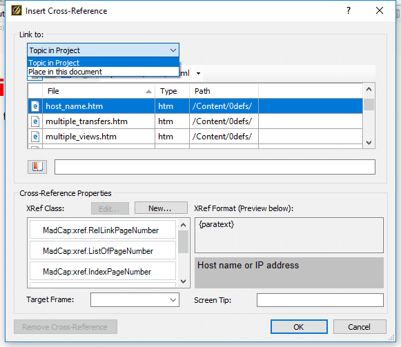
A cross-reference, or xref, does the same thing as a hyperlink. Clicking it jumps users to the target topic. Xrefs are less flexible than hyperlinks – you can only use them in two cases as shown in the Insert Cross-Reference dialog box’s Link To dropdown, below.
Although xrefs are less flexible than hyperlinks, they solve both drawbacks of hyperlinks.
- An xref “knows” the title of its target topic. If an xref links to the Frappe topic and you rename the target topic Milkshake, the xref’s wording changes automatically – effectively automating part of your maintenance work. (Flare automatically changes the wording when you generate the target. If you want to change the xref’s wording before you generate the target, click Tools > Update Cross-References.)
- A side benefit of the xref’s “knowing” the name of the target topic is that you don’t have to type and select the link text in order to create the link as you do with a hyperlink. Instead, when you select the target topic for your xref, the xref automatically uses the topic’s title as the link text.
- An xref “knows” when it’s being used in an online or print target. If you generate a print target, Flare automatically changes the xref’s format from a link style (…information about Frappes…” to a page reference style (…information about Frappes, see page 55)
Customization Through the CSS
- You can change the formatting of your xrefs by editing the MadCap | xref style in the Stylesheet Editor.
- You can also see how Flare changes an xref’s format for online vs. print targets by selecting the mc-format style in the Unclassified property group on the Stylesheet Editor and changing the Medium (on the Stylesheet Editor’s toolbar) from Default to Print.
Xref Drawbacks
You can use xrefs to create links between two topics in a given target but not between topics in different targets or out to external targets like PDFs or web pages. But since most links in a target usually go from one topic to another, this still leaves a lot of places to use xrefs.
Hyperlink and Xref Drawbacks
Hyperlinks and xrefs share a common drawback when used in task description topics. Clicking on the link takes users out of the original topic and out to topic B. A link in topic B might then take users to topic C, and so on. This makes sense but it breaks the flow of the material. Users who jump from topic A, the original topic, to B to C and so on can lose track of where they are in the steps.
What’s needed are links that access related content without taking users out of the primary topic. That’s where the remaining link types come in.
Popups
A popup keeps users in the starting topic and displays the target topic in a window that open on top of the starting topic.
NOTE: There's a bug that’s preventing a popup from displaying correctly so I don’t have an example as I write this.
Using a popup solves the problem of users linking out of a task description topic to another topic, then having to find their way back to the original topic and regain their focus.
When Use Popups
- To display short glossary definitions within the context of a topic or to display a quick piece of information, such as the phone number for tech support.
- To display interim steps in a larger procedure. For example, assume that step 1 in a process says to do X, followed by step 2 that says to do Y, and so on. If the users know how to do each of those steps, they can simply proceed. However, if users don’t know how to do task Y, they’re stuck. You could provide a link out to another topic that explains how to do task Y but the users have now lost their train of thought. With a popup, they can click on a link that pops open a window that explains how to do task Y but keeps them in the primary topic.
But there are several drawbacks to popups, as discussed below.
Customization Through the CSS
You can change popups’ properties by editing the MadCap | popup style in the Stylesheet Editor.
Popup Drawbacks
- You don’t control where the popup window opens – Windows does that based on the available screen space above or below the popup link.
- Because a popup window opens on top of the starting topic, the popup may cover something that users want to see.
- It may not be clear to new users how to close a popup in order to keep reading in the primary topic. You could create a snippet that tells users where to click in order to close the popup but that’s one more detail to worry about and one more bit of clutter on the screen.
- A new drawback comes out of the mobile space. Popups in a target running on a mobile device display as hyperlinks. This may be a problem if your design is based on using popups as popups.
What’s needed is a “popup-style” link that fixes these problems. That’s where dropdowns come in.
Dropdowns
Dropdowns are similar to popups in that clicking the link displays the target topic but keeps users in the starting topic, as shown below. But clicking the dropdown link “stretches” the screen and displays the dropdown body below the link. The first image shows the topic with the dropdown links unselected. The second image shows the HTML Element dropdown link selected and thus expanded.
Why use dropdowns instead of popups?
- The dropdown body always appears below the dropdown link, eliminating the uncertainty of where the body will display, as with popups.
- When users click a dropdown link, the screen “stretches” down in order to display the dropdown body rather than covering up part of the primary topic.
When might you use a dropdown?
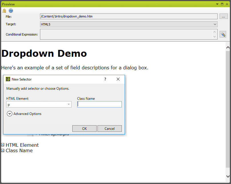
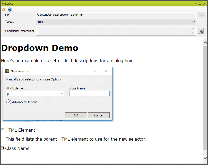
- In a topic that has a screen shot of a dialog box with many fields but you don’t want to show the full description of all the fields for fear of making the topic look too long. Instead, you list each field but hide its description in a dropdown. All the information is still present but hidden until users click on the link, thus making the topic look shorter and less intimidating.
- In a topic containing a list of steps. But if some users might not know how to perform a particular step, you might include a link called How or Tell Me How that, when clicked, opens a dropdown explaining how to perform that particular step.
Customization Through the CSS
Closed dropdowns look like normal text and are prefaced by a right-arrow-in-a-box icon. Expanded dropdowns look the same but the icon changes to a down-arrow in a box. You can change these properties by editing the MadCap | Dropdown styles in the Stylesheet Editor.
Dropdown Drawbacks
None, in my opinion. However, I’d be interested to hear competing opinions.
Expanding Links
Expanding links are similar to dropdowns except that the expansion is horizontal, like pulling a window shade sideways. This literally reformats the text paragraph that contains the link, as shown below. The first image shows the topic with the expanding link, the word hoagie, unselected. The second image shows the topic with the link selected.
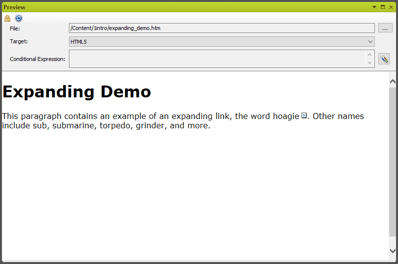
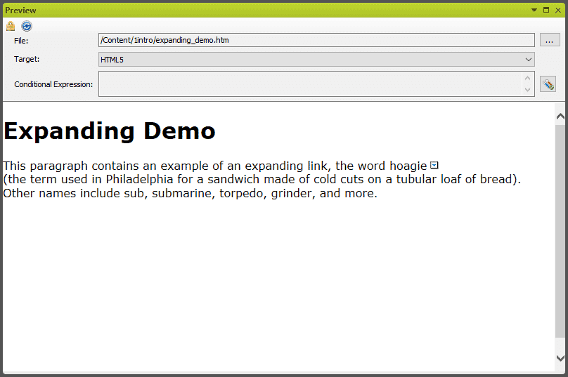
Like a dropdown and a popup, clicking the link displays the body but keeps users in the starting topic. However, expanding links can only contain text.
When might you use an expanding link? Typically, when you want to create a short, text-only link such as a definition or perhaps the phone number for tech support.
Customization Through the CSS
Closed expanding links look like normal text and are followed by the right-facing-arrow-in-a-box icon. Expanded expanding links display the link body to the right of the icon. You can change these properties by editing the MadCap | Expanding styles in the Stylesheet Editor.
Expanding Link Drawbacks
Expanding links, while cool, have a number of drawbacks.
- They’re text-only.
- The link body text format looks like regular text in a topic. This can make it hard to tell if the link is closed or expanded. The arrow-in-a-box icon indicates whether the link or closed or expanded by pointing to the right or down but users may not notice it. The solution is to change the format of the link body text to italic or red using the Stylesheet Editor.
- Creating expanding links takes more steps than creating most other links. For an expanding link, you select the text to use as the link. Then select Insert > Expanding Text. Then select the Show Tags > Show Markers option, which displays the link inside a pair of square brackets, followed by a pair of empty square brackets. Finally, select the text to use as the body and move it inside the empty square brackets. It’s not difficult; it’s just a little more involved.
- Expanding links dynamically reformat the paragraph in which they appear. Many users seem to find this disconcerting.
Togglers
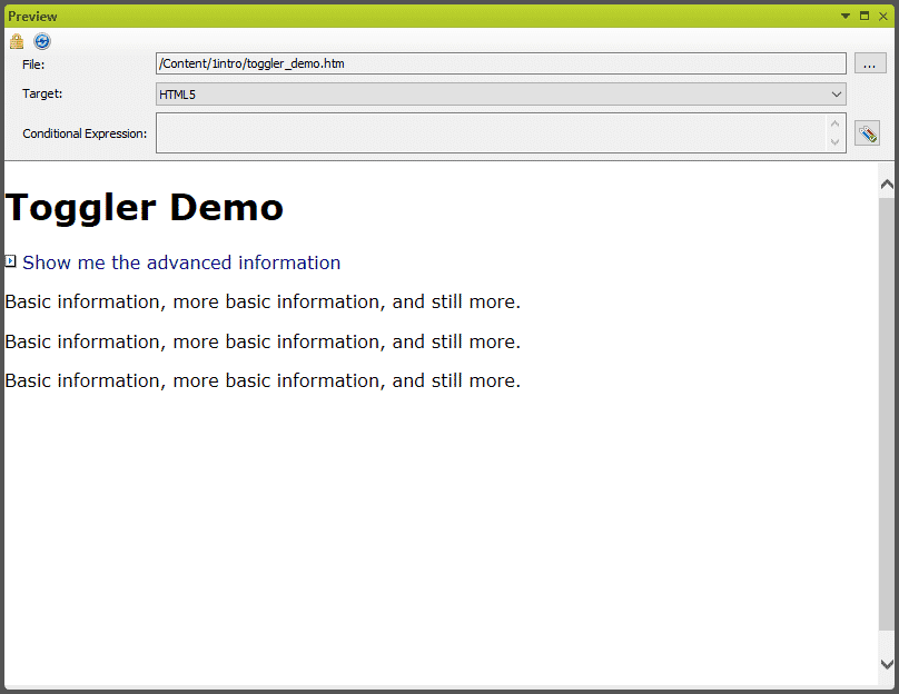
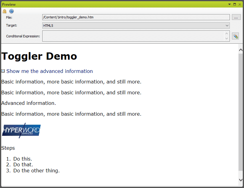
Togglers are similar to dropdowns in that clicking the link displays the link body while keeping users in the starting topic. However, unlike a dropdown, where the body displays below the link, clicking a toggler can display multiple text, graphics, tables, etc. anywhere in the topic.
When the topic opens, the toggler-controlled content is hidden until users click on the toggler, shown below. The first image shows the topic with the toggler unselected. The second image shows the topic with the toggler selected and various new pieces of content displayed – the advanced information paragraph, the graphic, and the list of steps.
Why use togglers?
- They offer tremendous flexibility; a toggler can display any type of content anywhere in a topic.
- They represent a user-oriented philosophy in terms of who controls what content is visible. The author can control what content is visible in a topic through the use of conditions but this takes control away from the users. Togglers give that control back to the users.
When might you use a toggler?
- When displaying a topic that includes a lot of supporting content but showing that content all at once might make the topic look too long or overwhelming.
- When documenting a procedure whose first few steps are identical for all users but whose later steps vary somehow, whether the user is in the US or Canada, for example. You could add two toggler buttons labelled US Steps and Canadian Steps to the topic. Clicking the appropriate one displays the appropriate steps without the visual clutter and potential for confusion of showing both sets of steps and telling the users to pick the appropriate ones.
Customization Through the CSS
Closed togglers look like normal text and are prefaced by the right-facing-arrow-in-a-box icon. Expanded togglers look the same but the icon changes to a down-arrow in a box. You can change these properties by editing the MadCap | Toggler style in the Stylesheet Editor.
Toggler Drawbacks
Togglers are cool but, like expanding links, require some extra work to create. The first step is to create all the content that will be in the topic. You then assign a name to each piece of content that you want to make controllable by the toggler. (Right-click in the block bar for that piece of content, select Name, and type the name.) Then add the text or graphic that you want to use as the toggler link. Finally, make that text or graphic the toggler (Insert > Toggler) and specify the named content items that toggler will control. This is per topic. Nothing difficult, but the number of steps may lead you to only use togglers on a limited basis.
Users might get confused as different pieces of content appear or disappear in a topic.
Miscellaneous Other Link Types
In addition to the types described above, there are several others.
- Table of Contents – While not necessarily a link type, a TOC is effectively a list of hyperlinks.
- Index – Like a TOC, the index is effectively a list of hyperlinks.
- Text popup – This is similar to a regular, or “topic” popup but with some crucial differences. A regular popup is a link to a topic where the target topic displays in a popup window. That topic is itself a topic. This means any number of links can point to it and any change to the content only has to be made once, in the target topic.
In contrast, a text popup looks like a regular popup but the target content is inserted in the topic that contains the popup link. So if you want to list the phone number for tech support as a text popup in ten different topics, you have to insert it in each of those ten topics. And if the phone number changes, you have to find those ten topics and modify the content in each one. (But, to be fair, you could create the text popup as a snippet.)
A text popup is text-only, so it’s less flexible than a regular popup.
Conclusion
If you haven’t yet gone beyond hyperlinks and topic popups, take a look at the other types of links that Flare offers. You may find some unexpectedly useful new ones.


