


Recently, while working on a new project, I realized my MadCap Flare TopNav design could use some improvements. Despite my best efforts, I couldn’t find a way to do this by colouring inside the lines. So this is the tale of how, with some perseverance and clever tricks, I convinced Flare to get creative.
I was working on the user guide for a product that was designed to be simple to use. Obviously this meant my user guide needed to feel light, airy, and also be simple to use.
I wanted to organize my topics based on how the user would most naturally approach finding help. This meant grouping together things that were similar, but not quite 100% related.
Normally in Flare, you’d do this by creating sub-menus that fly out when the mouse hovers over them. But I wanted something cleaner.
So I dreamed up menu separators that group my data together without fly-outs.
A look at how it works
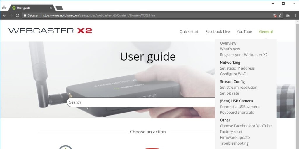
Here is a screen capture from my user guide. In the General TopNav menu, I have items labeled Networking, Stream Config, USB Camera, and Other. These look like normal topics, but they’re not.
I call them separators.
Take a look at the user guide to get a feeling for how the separators work. Both the menu at the top of the page and the individual page menus are updated with special styles for my separators.
How to add menu separators to your project
In the spirit of sharing and giving back to the community, I wrote this post to help you add the same kind of separators to your TopNav projects. I’m not an expert at this, so if you refine the process, let me know! I’m excited to see how we can improve on what I did.
To make it easy to follow along, I started with a new Flare project using the Top Navigation Basic2 template (from Flare 2017 r2).
Step 1: Build the project and see what you have
Follow along with me and build a basic Top Navigation Basic2 project. After building yours, you should see something like this in your browser:
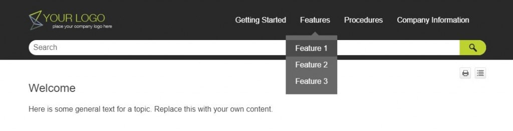
Step 2: Add some separator topics
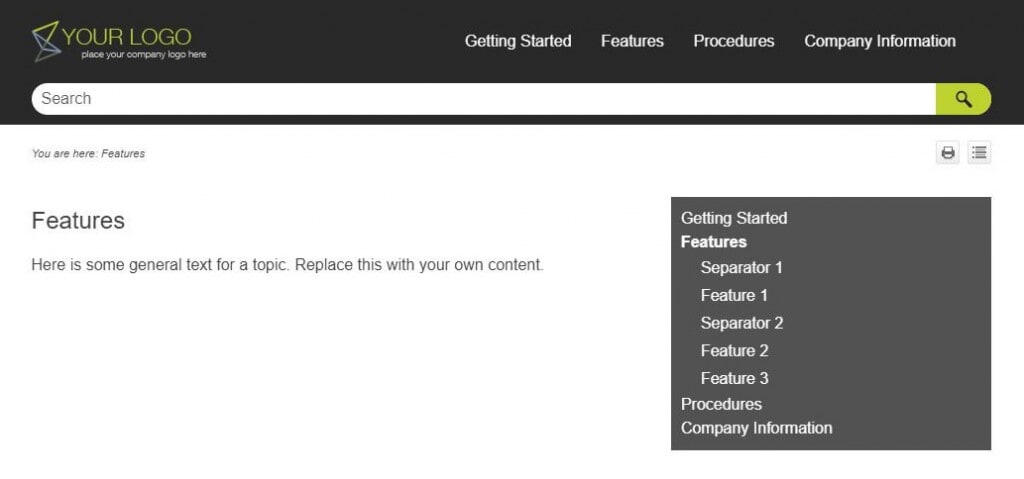
In Flare, open the TOC for the project and add two new items at the same level as Feature 1, Feature 2, and Feature 3. These items have no links, so you’ll need to add them with the New Item button. In the example below, you can see that I called mine Separator 1 and Separator 2.
Building the project works and includes the separators, but they end up looking a bit like broken links. They don’t have any visual distinction from normal help topics and the cursor changes to a hand when you hover over them. This is a start, but I definitely wanted a more polished look.
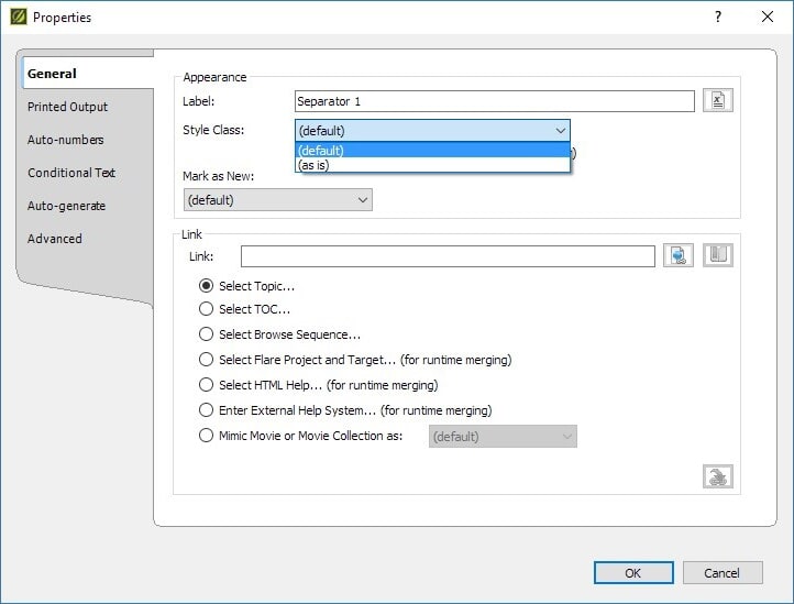
From everything I could tell, there was no way I could set CSS properties for these items. While investigating this idea, I read about skin properties called TOCStyles. The articles I found said you just had to specify a new TOCStyle in the Skin editor, then apply it to your TOC entry items. Sounds simple, right?
Step 3: Hack in the TOCStyle you need
Unfortunately I couldn't find any way to add these styles to my TopNav Skin. My best guess is that they are used in other output styles, like TriPane. But the Top Navigation HTML 5 skin editor doesn't (yet?) have a way to add or edit these styles directly. And the Style Class list for one of those new Separator topics added earlier has only two choices: default and as is.
This is where I start to get creative with Flare.
Not finding a way to add more styles within the confines of Flare, I decided to do what I often do for style editing and add the changes I needed by using tools outside Flare. I studied some examples from bits and pieces online, then opened my project skin in trusty Notepad++ and added my own new style to the bottom skin.
The skin file to edit is:
- "your-project-folder/Project/Skins/HTML5 - Top Navigation.flskn"
The lines to add just before </Styles> at the bottom of the file are:
<Style
  Name="TocEntry">
  <Classes>
  <StyleClass
    Name="TOCSeparator"
    Custom="true">
   <Properties>
   <Property
     Name="FontSize">1em</Property>
   </Properties>
  </StyleClass>
 </Classes>
</Style>
Step 4: Apply the TOCEntry style to your Separators
Now that you have the new TOCEntry style created, it’s actually simple to apply them to your separator entries from the TOC properties dialog in Flare.
With my Notepad++ changes saved to the Skin file, the new TOCSeparator class magically appears in the Style Class list.
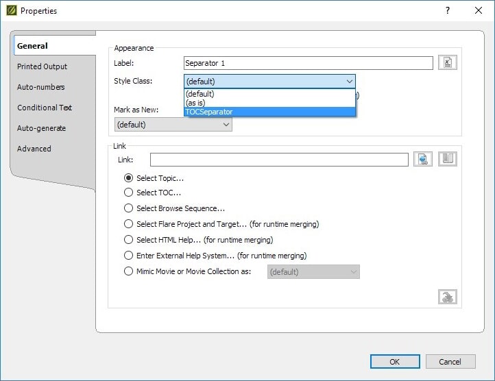
For each of your separators, right click the TOC entry and select Properties. Pick our new style (TOCSeparator) from the Style Class drop down.
If you rebuild now, you won't see any changes. Go ahead and try if you like. The next missing piece is to actually create a style class for this new skin element.
Step 5: Style your Separators
It took a few iterations and a heavy use of the browser debugger to get all the different styles right. But for the sake of brevity (and your sanity), I'll explain it all at once here.
First, use Notepad++ to open the stylesheet for the project:
- "your-project-folder/Resources/Stylesheets/styles.css"
Copy and paste the new style class to the bottom of the style sheet. Here's a breakdown of what the new style does:
- Adds 8px of padding before the separator.
- Makes the separator font bold and changes the font colour.
- Upon mouse hover, changes the cursor to the default cursor (arrow) instead of a hand.
- Changes the hover background so it's the same colour as the original menu instead of changing colours when the cursor hovers over it (only necessary if your project uses this background hover element, which the template does).
The exact code added is:
/* Add an entry for "separators" in the TOC. To use this style, select the item
in the Flare TOC and pick "TOCSeparator" as the TOC Entry style. Note along
with this change we needed to add the TOCSeparator entry to the Flare skin */
ul.navigation li.TOCSeparator
{
padding-top: 8px;
}
ul.navigation li.TOCSeparator a
{
font-weight: bold;
color: #2a2a2a;
/* Set the default cursor so it doesn't look like this is a link */
cursor: default;
}
ul.navigation ul > li.TOCSeparator:hover
{
background: #686868;
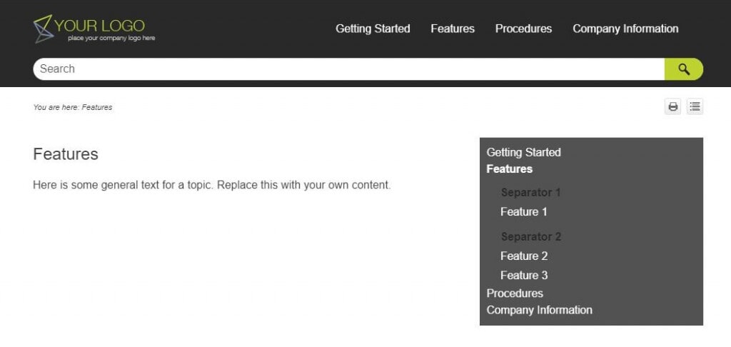
}When you rebuild the project now and load it into a browser window, it should look like this:

When you hover the mouse cursor over Separator 1 or Separator 2 you get no background colour change, and the cursor remains an arrow. Compare this with hovering over Feature 1 or Feature 2.
I was so excited to get this right! I knew right then and there that my separators were here to stay.
Step 6: Repeat for the side menus
The TopNav fixes are complete. But you’ll notice when you display a topic, the side menus are not displaying our separator styles.
Open your stylesheet in Notepad++ again to copy and paste in a few more lines. The breakdown of the new lines is:
- Add spacing before the separator menu items.
- Change the font weight and colour of the text (note the !important for these, I'll get into that later).
- Override the cursor and background colour on hover.
Here is the code for you to copy:
ul.menu li.TOCSeparator
{
    padding-top: 8px;
}

ul.menu li.TOCSeparator a
{
      /* Note that the next two items are being over-written by Flare classes.
       Use important to right this. */
      /* This is the Flare class: ul.menu._Skins_SideMenu.mc-component li > a  */
    font-weight: bold !important;
    color: #2a2a2a !important;
     /* Set the default cursor so it doesn't look like this is a link */
    cursor: default;
}

ul.menu ul > li.TOCSeparator > a:hover
{
       /* Flare over-writes this class too, so need to make it important
       to avoid hover decoration. */
    background: #525252 !important;
}
Once this change is saved, rebuild the target and open it in your web browser. You now have separators with some spacing, bold font, and darker colour than the rest of the side menu items.
Step 7: Tweak to perfection
The basics are working. The colours and spacing may not be to your liking, or may not match your project, but those things are easy to change by tweaking the CSS added to the stylesheet. Change it up, have fun with it.
Side note about !important
You probably noticed that some of the menu styles had to be marked !important in the .css file. Generally speaking, web developers don't like using this declaration in their .css files. Unfortunately I didn't have the time, nor do I have the expertise to avoid doing this. For now, I added lots of comments to inform future editors of my file why I made this decision.
If you have a suggestion for avoiding !important, I'd love to hear from you.
I hope this has been a helpful and informative explanation of my TopNav menu separators. If I’m inspired you to give it a try, leave a comment and share your project. I’d love to see how it turns out. Happy writing!

