


Have you ever wanted to create a cool, professional quality brochure or product foldout as part of your documentation set? Thanks to powerful single-sourcing features in MadCap Flare, you can accomplish this—and more—while simultaneously producing robust online output.
For example, I recently created the following two-sided product foldout:
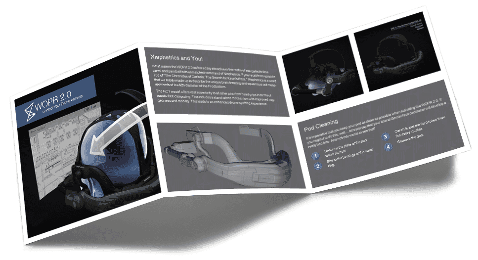
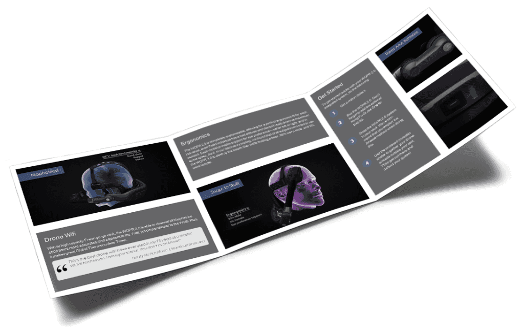
This print foldout was part of a Flare project from which I produced an online Help system that looked like this:
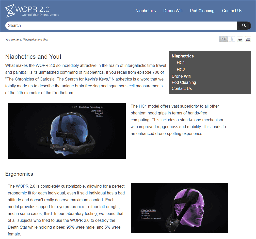
In other words, the online version of the foldout does not simply mean uploading the finished PDF somewhere that people can download it. Instead, it means that the same content for the foldout is used in a format that is intended for online consumption (e.g., a website, Help system, or knowledge base).
My Flare project already contained content (e.g., text, images) that I wanted to include in my new product foldout. If I had been using other tools that I’ve used in the past, I would have had to do a lot of copying and pasting of content from one place to another. Instead of doing that, I simply repurposed my content and generated it from the same Flare project.
Following are some thoughts about creating a product foldout and questions to ask before beginning the project.
Templates: To Use or Not To Use?
First, realize that Flare has many project templates designed for product foldouts and brochures.
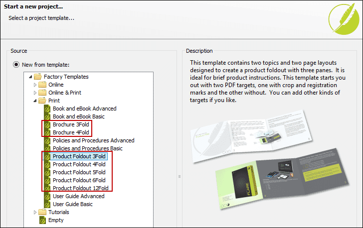
And by the way, brochures are very similar to product foldouts. The main difference has to do with the dimensions and how they are folded, but the steps to create them are pretty much the same.
Now, you could create a new project and select one of these templates. But what if you already have an existing Flare project, like I did? What do you do? Well, you could still create a separate, small Flare project based on one of the foldout templates and then import the most important files (e.g., topics, page layouts, TOC, target) into your main Flare project. That’s one option you might consider.
Another option is to just create the necessary product foldout files from scratch within your existing Flare project. This might be the best solution if your design is somewhat different from what you see in the Flare product foldout templates. This is the method I chose.
Before You Begin
There are some things you probably want to do before putting your files and content together:
- Get a Design Mockup. Most of us technical writers are not too proficient at design. I know I’m not. Hopefully you have access to a graphic designer, like I do. When attempting something new, I always meet with my graphic designer at the very beginning and explain what I’d like to accomplish. He then provides me with a mockup design, which we might tweak a few times before we consider it final. I always have this mockup next to me, or on a second monitor, as I try to re-create the look and feel in Flare.
- Don’t Forget the Assets. Your graphic designer’s mockup is likely to have files and information you will need, such as images and style settings. Make sure you gather those assets and add them to your Flare project.
- Create/Edit Styles. Your product foldout might use some of the same styles (e.g., h1, p) that you already have in your Flare project for online output. But there’s a good chance that you’ll need them to look a little different in the foldout PDF. In the mockup I received from my designer, the font size needed to be smaller and much lighter in color than what I was using for the online output. So I used my Print medium in the stylesheet to make the changes I needed. If I already had been creating a different PDF target (e.g., for a user manual), I might have created a third custom medium to use specifically for my foldout. But I didn’t have another PDF target in my project, so I just used the factory Print medium.
- Create Snippets. In my example that I’ll go through in a moment, I realized that there were a handful of paragraphs from my online output that I wanted to re-use in the foldout. So before creating my foldout and adding content, I turned those paragraphs into snippets. That way, I wouldn’t need to copy and paste text, and any future changes to those paragraphs could be made in just one place.
Hmmm… What To Do, What To Do
When I first looked at my designer’s mockup, I knew that there were several ways I could reproduce it. If you were to give this assignment to 10 different technical writers, it wouldn’t be surprising to see them follow 10 different approaches to get the same end result.
Probably the easiest solution is to have the graphic designer provide two large images—one for the front and another for the back side of the foldout—that would show all of the required content. I could then set those two big images on the backgrounds of the page layouts. But doing this would take control away if I later needed to update the text, or if I wanted to get it translated.
So I had to ask myself some questions:
- How many topics would be needed? The foldout mockup had two sides—front and back—so it seemed like the best solution was to create one topic for each and to insert snippets into those topics whenever I came across text that was shared with other topics.
- How many page layout files should I create? Because the front of the foldout was going to look different from the back side in terms of the content structure, I knew I would need two page layouts. If the structure was essentially the same, I could have gone with just one page layout.
- Should I create one body frame in each layout, or multiple body frames? Looking at the mockup, the content appeared as a series of squares and rectangles, either containing text or images. Furthermore, these content rectangles were in various positions and sizes, rather than all being the same. I could have created just one body frame in each page layout, organizing the text and images within it via the topic, but it seemed like that might be more work. So I decided to create multiple body frames to hold the text, arranging them as shown in the mockup.
- Should my body frames have multiple columns? Using more than one column in a body frame is an easy way to section content, but because my body frames would all be relatively small, I knew that I would only need one column in each.
- What other kinds of frames would I need? For the text areas, I would use the body frames. For the images, I could have inserted them directly into the topic (within those same body frames). I also had the option of setting some images in the background of the page layout or body frames. But the easiest, most straightforward solution seemed to be image frames, so that’s what I chose.
Next Steps
In the next blog post, I'll walk through the process of creating print brochures within Flare, going from creating topics, designing the layout, and ending with an output ready for print and web.
To view Part 2, click here.